Theme Documentation
Introduction
Thank you for purchasing TheFox WordPress Theme. Before you get started, please be sure to always check out these documentation files. We outline all kinds of good information, and provide you with all the details you need know to use TheFox Theme.
If you are unable to find your answer here in the documentation, please contact us on our Support Forum or directly from our themeforest account
What is included in the price?
- TheFox WordPress Theme
- Child Theme
- Lifetime Updates
- Theme Documentation
- Premium Plugins
- Premium Plugins documentations
- Premium Support - To our support forum.
Please don't forget to rate TheFox with 5 stars and leave a nice review, it means a lot to us.
Simply log in into your Themeforest, go to Downloads section and click 5 stars next to the TheFox WordPress theme.
Thanks!
Tranmautritam Team
Theme Installation via WordPress
When you download the theme from Themeforest, you will get an archive file in .zip extension.
You need to unzip that archive. When done, you should see Thefox.zip (zip file name can be changed from version to version).
Please, follow the steps below to install TheFox Theme.
Step 1 - Login to your WordPress Dasrdoard.
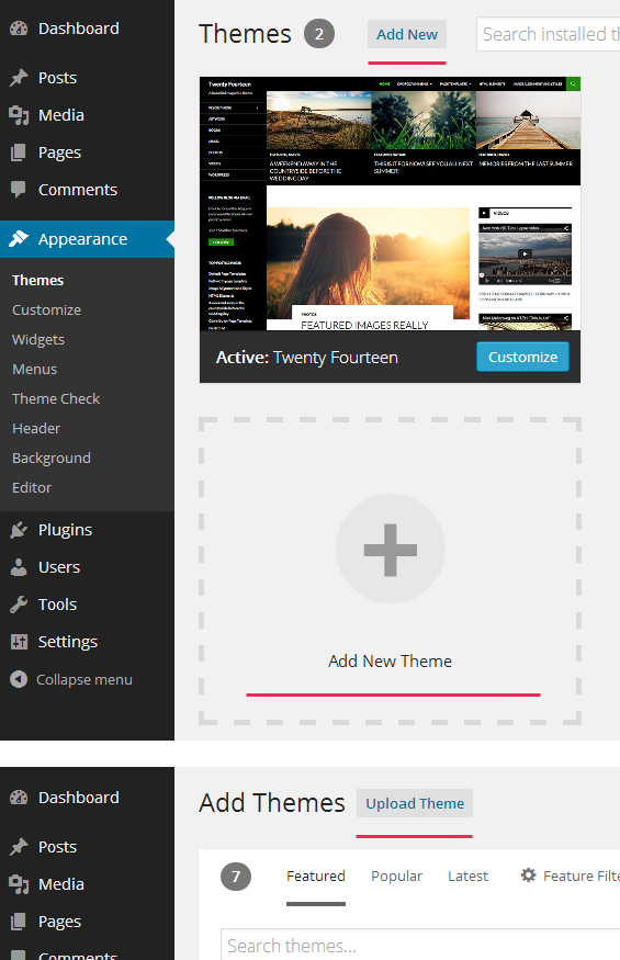
Step 2 - Go to Appearance > Themes. Click Add new button, located at the top of the screen or Add new theme ( see screenshots below ).
Step 3 - Click on Upload button at the top of the screen.
Step 4 - Choose Thefox.zip.
Step 5 - Wait while the theme is uploaded and installed then activate the theme.
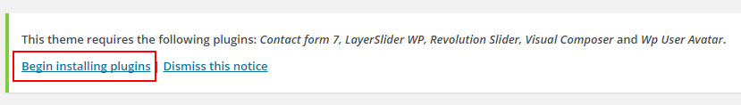
Step 6 - After activating the theme a notice should appear on the top of the screen, click on begin installing plugins ( see screenshots below ).
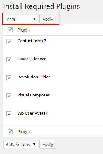
Step 7 - Select all the plugin,change Bulk Actions drop to Install then click apply ( see screenshots below ).
Step 8 - Congratulation you are ready to use TheFox, check the First Steps part of our documentation to see what you may want to do before starting to edit your WordPress Site.
Common Theme Installation Problems
“Are you sure you want to do this?”
If you get the “Are you sure you want to do this” message when installing TheFox.zip file via WordPress, it means you have an upload file size limit. Install the theme via FTP if this happens, or ask your hosting company to increase the limit.
Missing stylesheet file
If you get an error saying that the stylesheet is missing, then you have uploaded the wrong folder. Please check that you are uploading the TheFox.zip within the Theme Files folder. You have to unzip the file that you download from Themeforest to find this.
Theme Installation via FTP
If you are going to install the theme using FTP, you will need an FTP Client, such as FileZilla.
When you download the theme from Themeforest, you will get an archive file in .zip extension.
You need to unzip that archive. When done, you should see TheFox Folder(folder name can be changed from version to version).
Please, follow the steps below to install the theme via FTP:
Step 1 - Log into your hosting space (server) via FTP client.
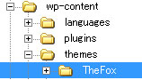
Step 2 - In extracted archive folder, find TheFox folder
Step 3 - Upload the TheFox folder to your server in path .../wp-content/themes/.
Step 4 - The uploaded path should be like this: .../wp-content/themes/TheFox/
Step 5 - Login to your WordPress Dasrdoard and go to Appearance > Themes and activate the TheFox Theme.
Step 6 - After activating the theme a notice should appear on the top of the screen, click on begin installing plugins ( see screenshots below ).
Step 7 - Select all the plugin,change Bulk Actions drop to Install then click apply ( see screenshots below ).
Step 8 - Congratulation you are ready to use TheFox, check the First Steps part of our documentation to see what you may want to do before starting to edit your WordPress Site.
Additional Links
Setting up the Demo Content
Before importing the dummy data Make sure you have all the plugin installed ( if you want to use woocommerce, make sure to install woocomerce first ).
One Click Importer
We will explain how to import the demo usign the Theme One Click Importer
Single page Importer
We will explain how to import the demo usign the Single Page Importer
WordPress Importer
We will explain how to import the demo usign the WordPress Importer
Error or Problem with Import of the Demo
If you have problem with the Import of the demo please check this section
One Click Importer
Step 1 - Log into your WordPress Dasrdoard.
Step 2 - Go to TheFox > Demo Importer.
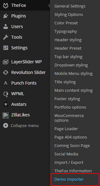
Step 3 - Then Click on Import Demo.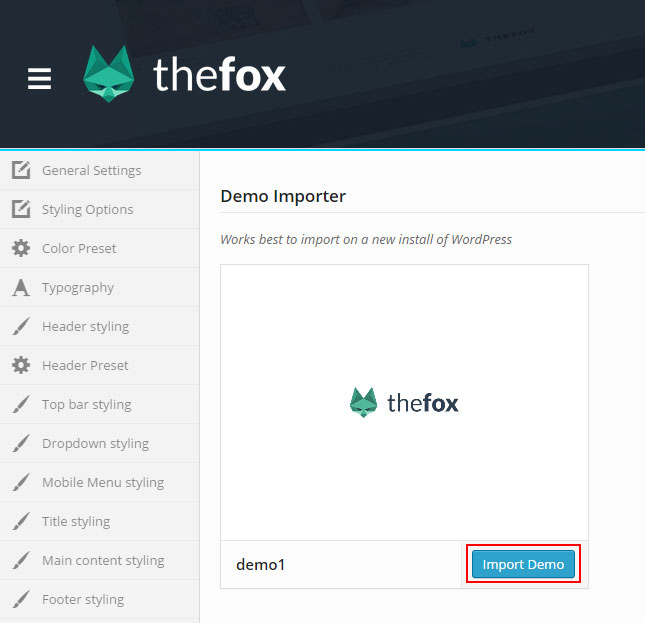
Step 4 - The Dummy content is really big and may takes more then 30 minutes to import depending where you are living, Do not interrupt/cancel the import process!
Step 6 - Done! But you still need to set the Menu, Widget, Homepage.
Step 1 - Log into your WordPress Dasrdoard.
Step 2 - Go to Appearance > Import Demo Data.
Step 3 - Then Click on Import Singles.
Step 4 - After this select the pages or posts you want to import, you can use Shift + click to select multiple pages and click import
Step 5 - Downloading single page will still download the placeholder images, so it may takes a little time but every import should be over within 3 minutes
Step 6 - Done! But you still need to set the Menu, Widget, Homepage.


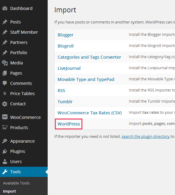
WordPress Importer
Step 1 - Log into your WordPress Dasrdoard.
Step 2 - Go to Tools > Import. Then click on WordPress ( bottom of the list ).
Step 3 - A window should appear click the Install now button which is on bottom right.
Step 4 - Click Activate plugin & Run Importer. Then choose the thefox_demo.xml file and click upload file and import Do not interrupt/cancel the import process!
Step 6 - Done! But you still need to set the Menu, Widget, Homepage.
The importer should be run only once. If something went wrong and you need to import the content again, you may need to reset your WordPress.
Use this plugin to reset the WordPress database : http://wordpress.org/plugins/wordpress-database-reset/
Error or Problem with Import of the Demo
If you have problems importing the demo ( example : infinite loading, error 505 with when using wordpress importer ) then you may have a problem with the server settings. Please check this article : What To Do If Demo Content Import Fails.
Upload your logo
You can upload your logo image in the Theme Options. If the logo is not uploaded, then your site name will be used.
Please, follow the steps below to upload your logo:
Step 1 - Login to your WordPress Dasrdoard.
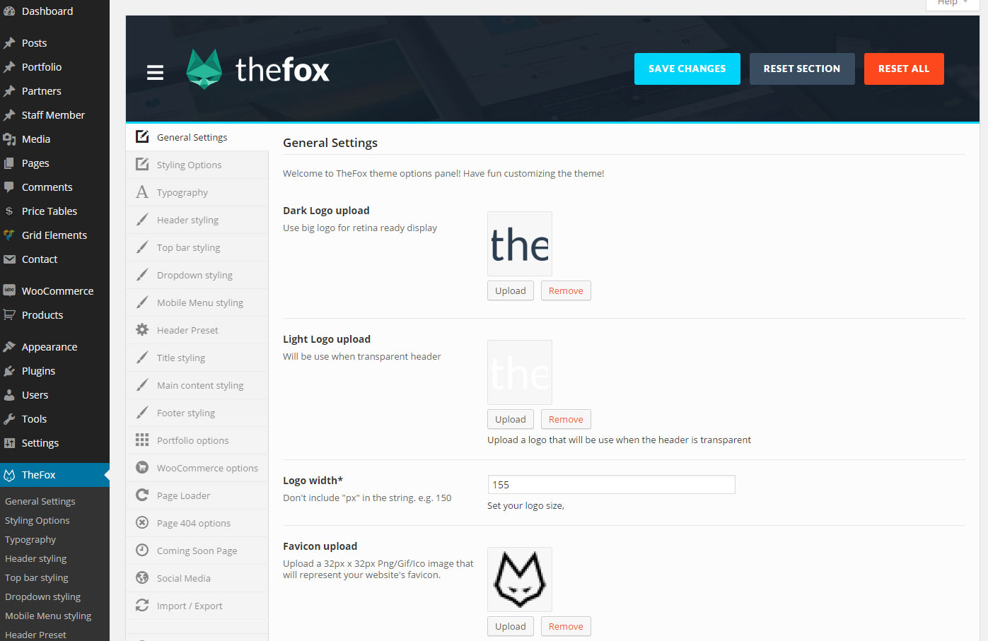
Step 2 - Go to TheFox > General Settings.
Step 3 - Upload a Dark Logo ( Used For normal header ) and a Light logo ( Used for Transparent Header ). Size doesn't matter but if you want to make logo retina use a big size ( our logo is 475px x 135px ).
Step 4 - Set the width size for your logo ( default 155 ).
Step 5 - Upload your favicon - should be a 32px x 32px Png/Gif image.
Change Theme Layout / Color
You can set unique color for every part of the theme, the option are separate in seven section.
Follow the steps below to find out how to change the theme color and design:
Step 1 - Login to your WordPress Dasrdoard.
Step 2 - Click on Thefox to get to the Theme option panel.
Step 3 - Choose which part of the theme you want to modify
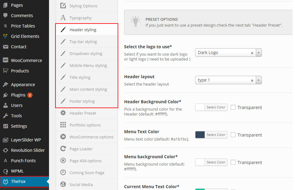
- Header Styling: To modify header and menu color
- Top Bar Styling: To modify header top bar color
- Dropdown Styling: To modify menu dropdown color
- Mobile Menu Styling: To modify mobile menu dropdown color
- Title Styling: To modify page title color
- Main Content Styling: To modify page main content color
- Footer Styling: To modify footer color
Step 4 - When you have finish to customize the color don't forgot to save
Advice - It may be more easy to customize the color by going to Appearance > Customize so you can see color change live, or if you want use one of our preset color.
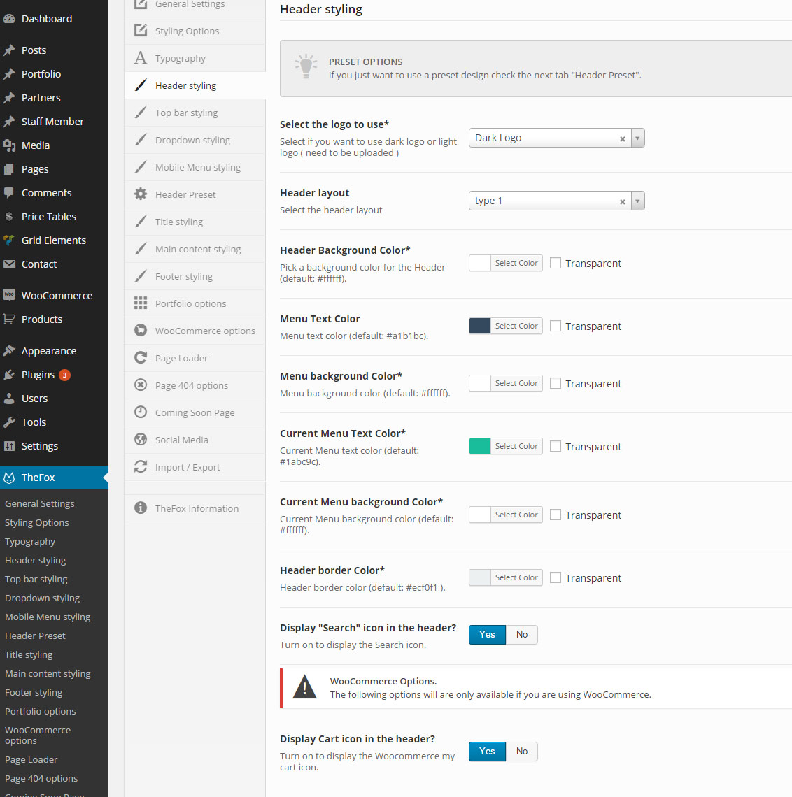
Change Navigation / header
TheFox comes with 18 navigation / header style.
Follow the steps below to find out how to change the navigation, header:
Step 1 - Login to your WordPress Dasrdoard.
Step 2 - Go to TheFox > Header Styling .
Step 3 - Select if you want to use Dark or Light Logo.
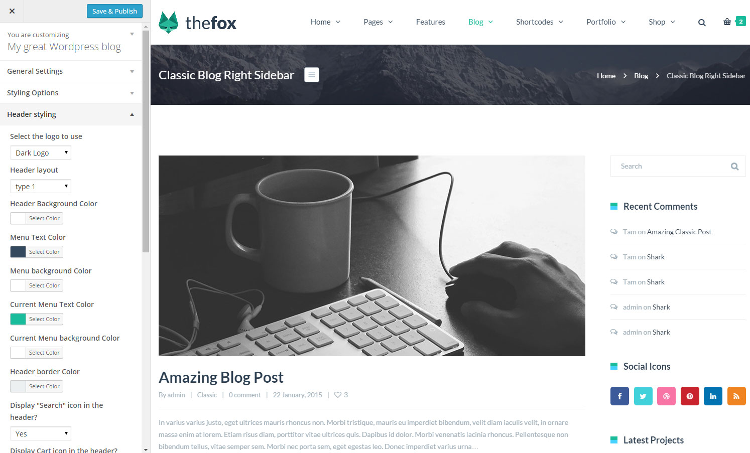
Step 4 - Select the header layout ( between 18 style ). To see the diffrence go to Appearance > Customize to be able to customize the header live and see the change directly.
Step 5 - Change the Color option to adjust the header to your website. We recommend you to change color by going to Appearance > Customize to be able to customize the header live and see the change directly
Header Preset - You like the header you saw on our Demo? We have set Header preset so you don't have to configure anything, go to Thefox > Header Preset to use one
From Theme option
From Appearance Customize
Menu Setup
Creating your menu
First we will see how to create your menu
Adding pages to your menu
How to add page to our new menu
Assigning a Menu to a Location
Select where to show our menu
Mega Menu
Learn how to make an awesome mega menu
Menu with Icon
Learn how to use icon for the menu
Creating your menu
Step 1 - Login to the WordPress Dasrdoard.
Step 2 - From the 'Appearance' menu on the left-hand side of the Dasrdoard, select the 'Menus' option to bring up the Menu Editor.
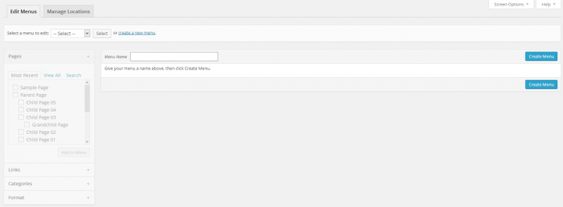
Step 3 - Select Create a new menu at the top of the page.
Step 4 - Enter a name for your new menu in the Menu Name box.
Step 5 - Click the Create Menu button.
Your menu is now defined, and you can now add pages to it (steps below).
Adding pages to your menu
The Screen Options allow you to choose which items you can use to add to a menu. Certain items, like Posts are hidden by default. The Screen Options are located in the top right corner of your WordPress Dasrdoard.
Step 1 - Locate the pane entitled Pages.
Step 2 - Within this pane, select the View All link to bring up a list of all the currently published Pages on your site.
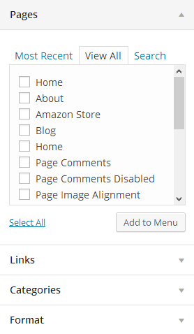
Step 3 - Select the Pages that you want to add by clicking the checkbox next to each Page's title.
Step 4 - Click the Add to Menu button located at the bottom of this pane to add your selection(s) to the menu that you created in the previous step.
Step 5 - Click the Save Menu button once you've added all the menu items you want.
Your custom menu has now been saved.
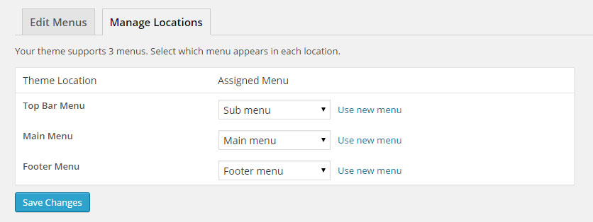
Assigning a Menu to a Location
Once you've created a menu and filled it with items, it's time to assign it to one of the theme pre-defined locations.
Step 1 - Go to Appearance > Menus and click Manage Locations.
Step 2 - Assign each Theme Location with a menu. You can assign menus to multiple Theme Locations.
Step 3 - Click the Save Changes button.
Mega Menu
TheFox features Mega Menus. The mega menus are available only for top level navigations items only in "Main Menu" area.
Follow the steps below to create a mega menu:
Step 1 - Add a an item to the menu editor. This has to be a top level item!
Step 2 - Click on arrow icon in the top right-hand and exapnd.
Step 3 - Check the "Enable megamenu".
Step 4 - Write in the "Megamenu columns" the number of columns you want to use (from 3 to 5).
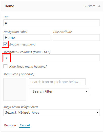
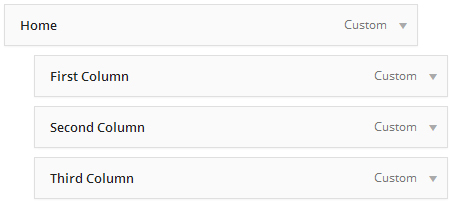
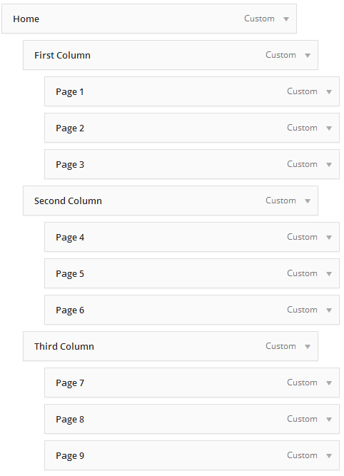
Step 5 - Now, you need to add child menu items, which will represent columns in the mega menu.First level of child items will represent Titles in each of 3 columns.
Add 3 sub child menu items, like on the image below.
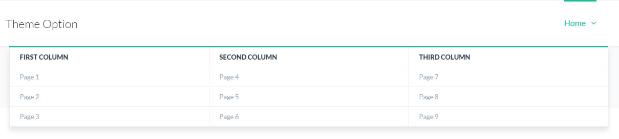
Step 6 - Now, add child items to each of those columns. This will represent your actual sub-menu pages. Take a look at the image below.
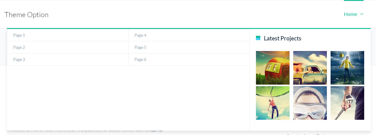
The menu dropdown should now look something like this :
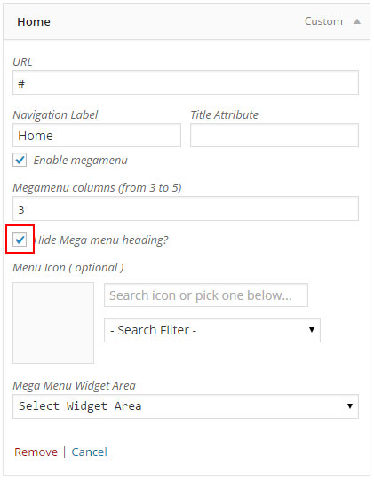
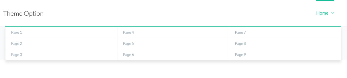
Step 7 - If you want to Remove the Titles (First Column, Second Column Third Column) Go back to the Mega menu setting and check Hide Mega Menu heading.
The menu dropdown should now look something like this :
Step 8 - Adding Widget / Image to the Menu. To do this first you need to have a sidebar set with some widget ( you can create new sidebar go to Appearance > Sidebar ). Menu doesn't work with all the widget, but works will all TheFox Widget and Default WordPress Text Widget
Step 9 - When you have set your sidebar with widget click on the sub child menu you want to turn into widget area ( we will turn the third column into a widget area), make sure it doesn't have sub menu
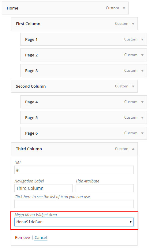
The menu dropdown should now look something like this :
Menu with Icon
You can easily add Icon for the "Main Menu" Iteam.
Follow the steps below to see how use item in menu:
Step 1 - Add items to your menu editor, when menu is over update / publish menu.
Step 2 - After publishing / updating your menu select the item you want to add item to and click on the arrow icon in the top right-hand and exapnd.
Step 3 - Select the "Filter for the icon", wait for the icon to appear and select the icon.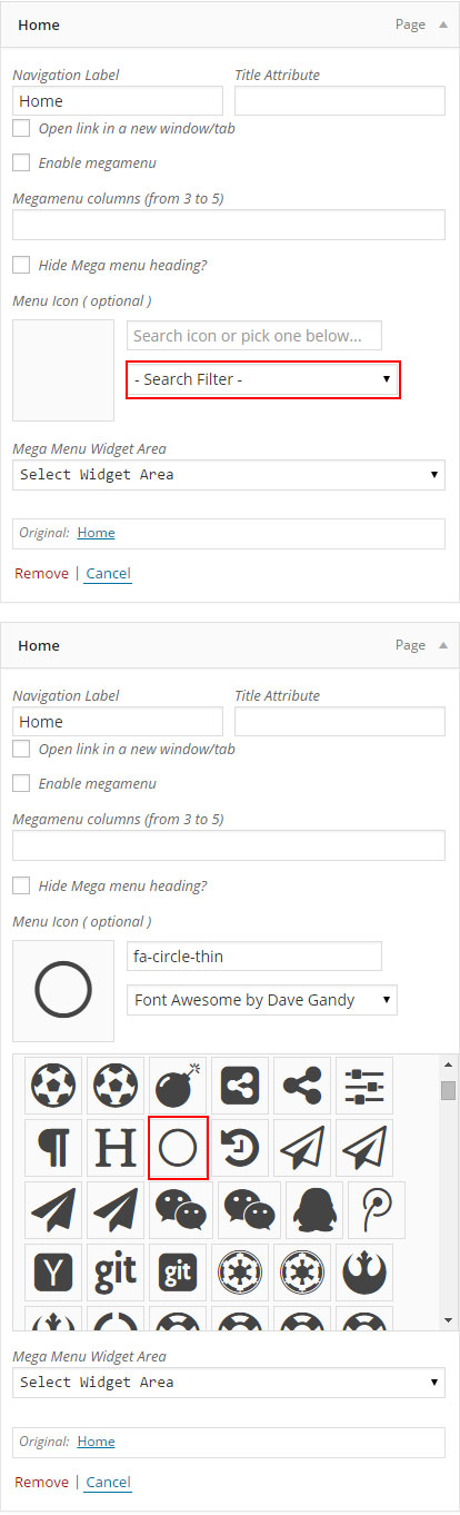
Step 4 - Update your menu.
Create Blog Posts
Adding Posts
You can customize each posts modifying the post options.
We will explain you how to create post using TheFox.
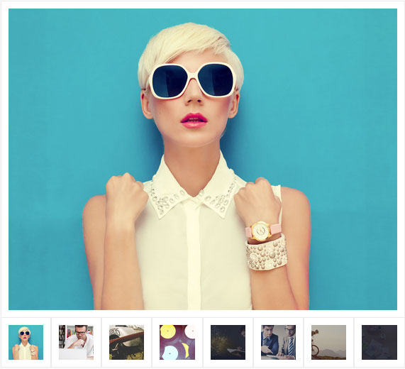
Gallery Posts
We will explain you how to create Gallery Post.
Video Posts
We will explain you how to create Video Post.
Audio Posts
We will explain you how to create Audio Post.
Quote Posts
We will explain you how to create Quote Post.
Post Options
Explain the Post Options
Show your Posts
How to create a Blog page to show your post
Adding Posts
Step 1 - Log in to your WordPress Administration Panel (Dasrdoard)..
Step 2 - Click the 'Posts' tab.
Step 3 - Click the 'Add New' sub-tab.
Step 4 - Start filling in the blanks: enter your post title in the upper field, and enter your post body content in the main post editing box below it.
Step 5 - As needed, select a category, add tags, post format, fill in the meta setings below the editor.
Step 6 - Upload a featured image for your Post.
Step 7 - Scroll down until you see the Post options box, there you will be able to customize the post. Please check Post options page for more information.
Read More - To make the post appear with a "read more" link you need to use the Read more tag button . 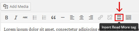
Create Gallery Post
Step 1 - Change Post Format to Gallery. 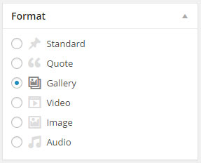
Step 2 - Scroll down until you see the Featured Gallery then click select images. 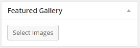
Step 3 - Upload or Select the image you want to use by using Ctrl + Click then click Create new gallery. 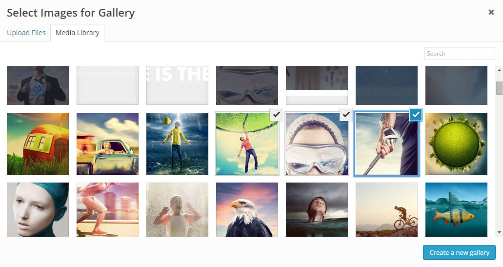
Step 4 - You can now drag and drop the image to change the order, when finished click insert gallery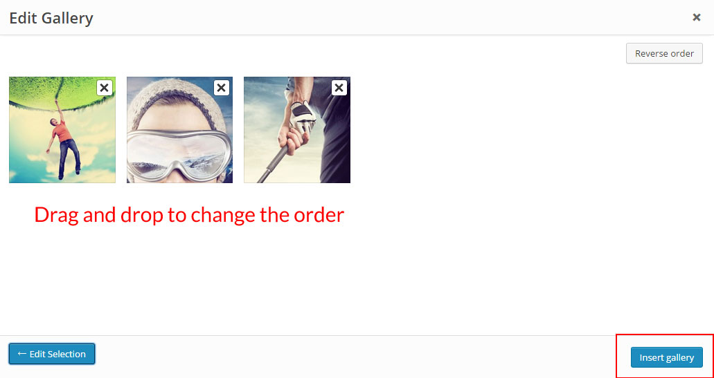
Step 5 - When you are finished, Update your Post, it should looks like this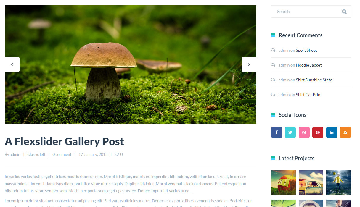
Video Post
Step 1 - Change Post Format to Video. 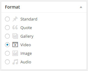
Step 2 - Scroll down until you see the Post options Video Embed Code then past your Vimeo or Youtube embed code. 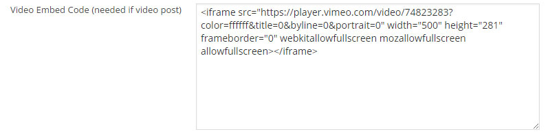
Step 3 - When you are finished, Update your Post, it should looks like this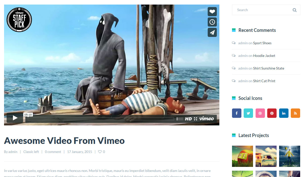
Audio Post
Step 1 - Change Post Format to Audio. 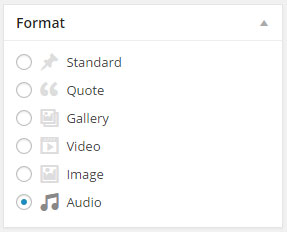
Step 2 - Now you need to add an audio file to your post, the audio file needs to be inserted before any content
Step 3 - Click Add Media and upload your audio file or select from your file, then click insert into post. Your post should look like this 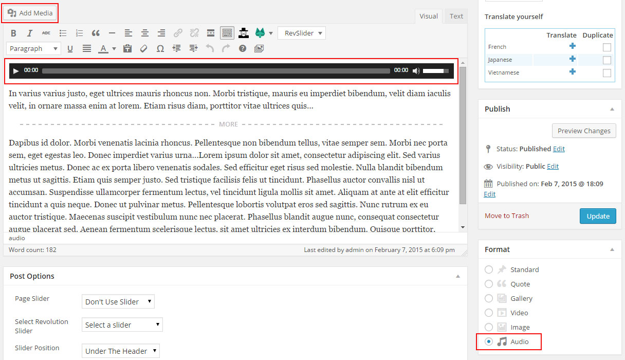
Step 4 - Publish or Update your post, it should looks like this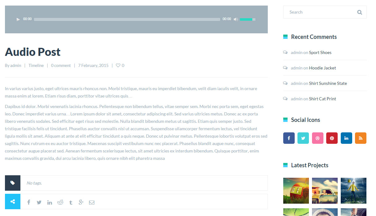
Quote Post
Step 1 - Change Post Format to Quote. 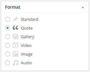
Step 2 - Scroll down until you see the Post options Quote Text, Quote Author name then write your Quote text and Quote author name.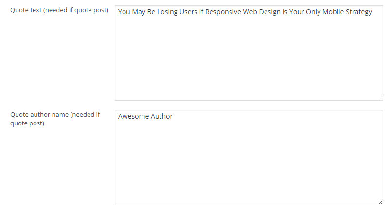
Step 3 - When you are finished, Update your Post, it should looks like this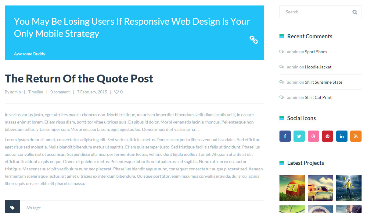
Post Options
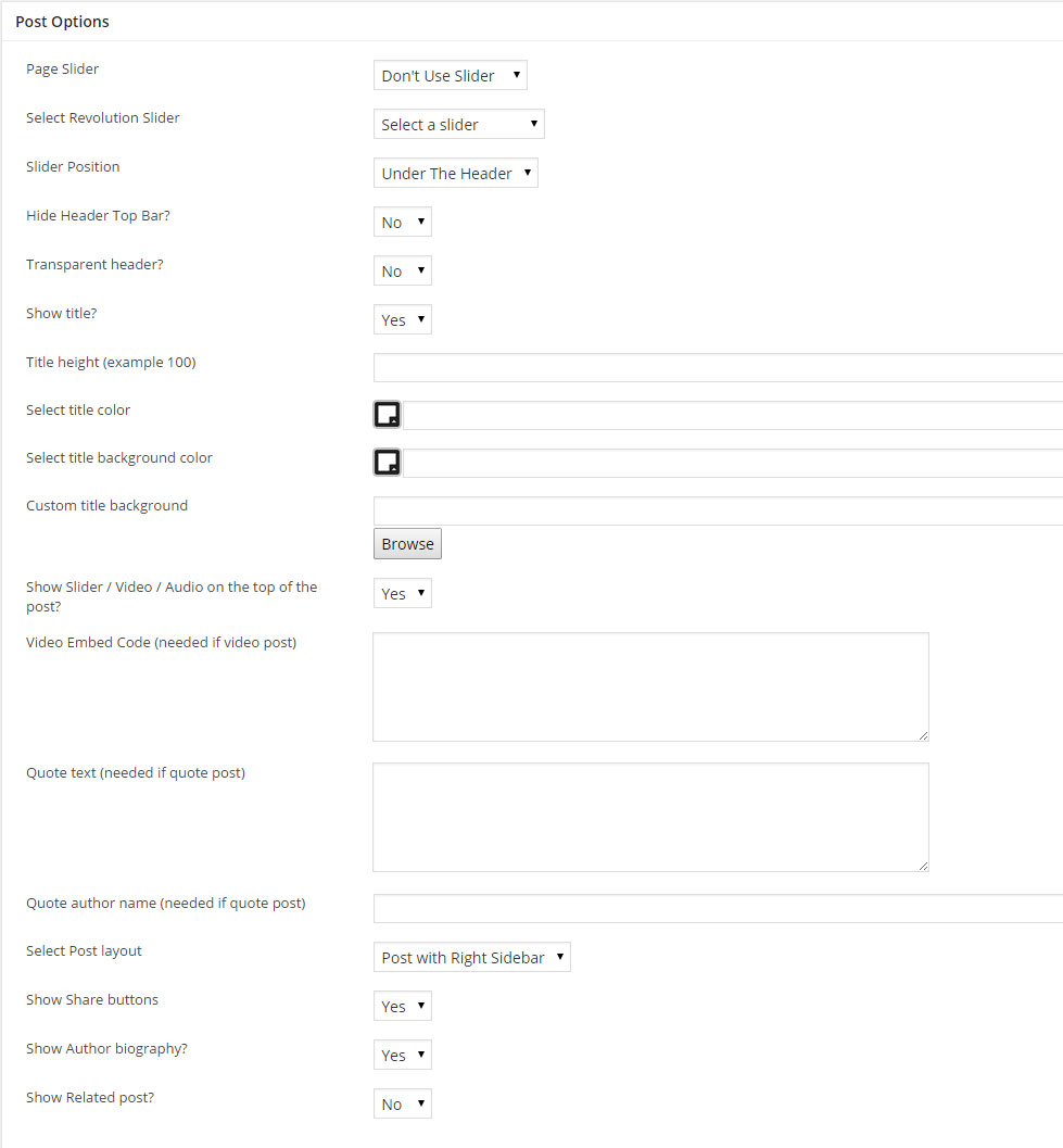 Page Slider - You can use a Revolution or Layer Slider top show on the Post page
Select Revolution / Layer Slider - Select the Slider you want to use for the post
Slider Position - Select if the Slider should be above or under the header
Hide Header top bar - Select if you want to hide the header top bar for this post
Transparent Header - Select if you want to use a Transparent Header for this post
Show title - Select if you want to show or hide the post title section
Title Color - If you want to change the title text color
Title Background Color - If you want to change the title background color
Custom Title Background - If you want to use an image for the title background, you can upload an image or use an image link
Show Slider / Video / Audio on the top of the post - Select if you want to show or hide the featured image / gallery / video / audio / quote on the top of the post
Show Breadcrumbs - Select if you want to hide or show the breadcrumbs
Video Embed Code - Fill this field to make the video appear on top of your post
Quote text - Fill this field to make the quote text appear on top of your post
Quote author name - Fill this field to make the quote author name to appear on top of your post
Select Post Layout - Select the post Layout. Post with Right, Left or No Sidebar
Show Share Buttons - Select if you want to show or hide the share button 
Show Author Biography - Select if you want to show or hide the Author Biography 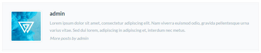
Show Related Post - Select if you want to show or hide the Related post carousel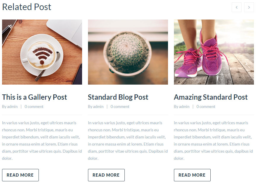
Show your Posts
To you show your posts you need to create a Blog page. Click here to check how create a blog page.
Create Portfolio post
Add Portfolio Items
How to add Portfolio item to showcase your work.
Gallery Portfolio Posts
We will explain you how to create Gallery Post.
Video Portfolio Posts
We will explain you how to create Video Post.
Portfolio post Options
Explain the Portfolio Post Options
Add Portfolio Items
Step 1 - Log in to your WordPress Administration Panel (Dasrdoard).
Step 2 - Click the 'Portfolio' tab.
Step 3 - Click the 'Add New Portfolio Item' sub-tab.
Step 4 - Start filling in the blanks: enter your portfolio title in the upper field, and enter your portfolio body content in the main post editing box below it.
Step 5 - Add tag(s) to your item, the tags will be used as a filter on Portfolio Template pages.
Step 6 - Scroll down until you see the Portfolio otions box, there you will be able to customize the portfolio post. Please check Portfolio options for more information.
Step 7 - Upload a featured image for your portfolio item then publish it.
Gallery Portfolio Posts
Step 1 - Scroll down until you see the Featured Gallery then click select images.
Step 2 - Upload or Select the image you want to use by using Ctrl + Click then click Create new gallery.
Step 3 - You can now drag and drop the image to change the order, when finished click insert gallery
Step 4 - When you are finished, Update your Post
Video Post
Step 1 - Scroll down until you see the Portfolio options Video Embed Code then past your Vimeo or Youtube embed code.
Step 2 - When you are finished, Update your Post
Portfolio Post Options
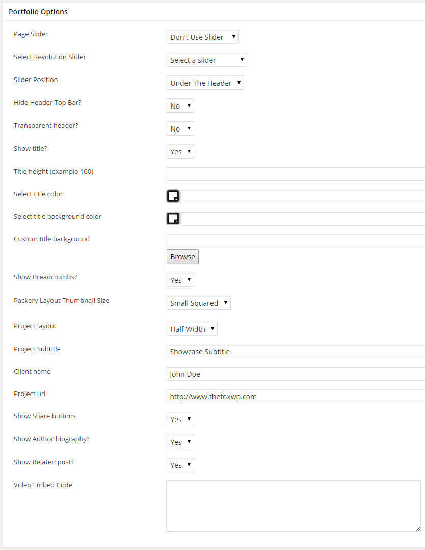 Page Slider - You can use a Revolution or Layer Slider top show on the Post page
Select Revolution / Layer Slider - Select the Slider you want to use for the post
Slider Position - Select if the Slider should be above or under the header
Hide Header top bar - Select if you want to hide the header top bar for this post
Transparent Header - Select if you want to use a Transparent Header for this post
Show title - Select if you want to show or hide the post title section
Title Color - If you want to change the title text color
Title Background Color - If you want to change the title background color
Custom Title Background - If you want to use an image for the title background, you can upload an image or use an image link
Show Breadcrumbs - Select if you want to hide or show the breadcrumbs
Packery Layout Thumbnail Size - Select The Post Thumbnail size when used in Portfolio Packery Layout
Project Layout - Select the Post Layout, Half Width or Full width 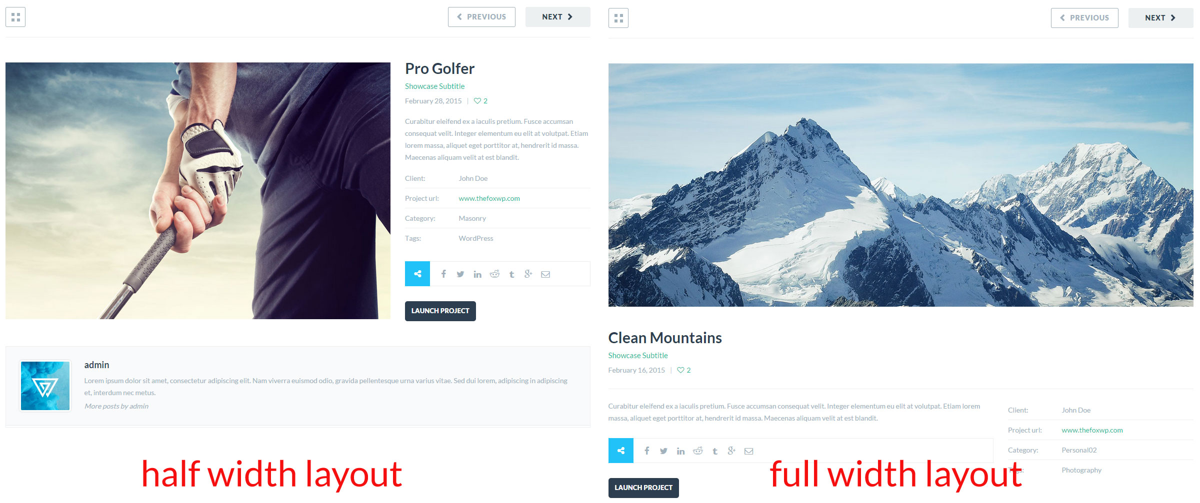
Project Subtitle - Fill this field to add a subtitle to the project
Client name - Fill this field to make the client name appear on the project
Project url - Fill this field to make the project url appear on the project and will also add a button linked to the project
Show Share Buttons - Select if you want to show or hide the share button
Show Author Biography - Select if you want to show or hide the Author Biography
Show Related Post - Select if you want to show or hide the Related post carousel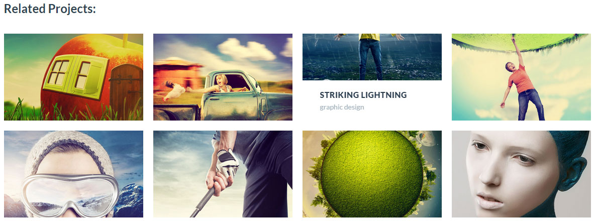
Video Embed Code - Fill this field to make the video appear on top of your post
Showing Portfolio Items
To you show your portfolio items you need to create a Portfolio page. Click here to check how create a portfolio page.
Create Blog page
Create Blog page
Follow the steps bellow to understand how to create a blog page.
Blog settings
Explain the Blog module settings.
Create blog page
Step 1 - Log in to your WordPress Administration Panel (Dasrdoard)..
Step 2 - Click on Pages > Add New.
Step 3 - Give your page a name then Change the Editor to Backend Editor ( you need to have the Visual Composer plugin activated ).
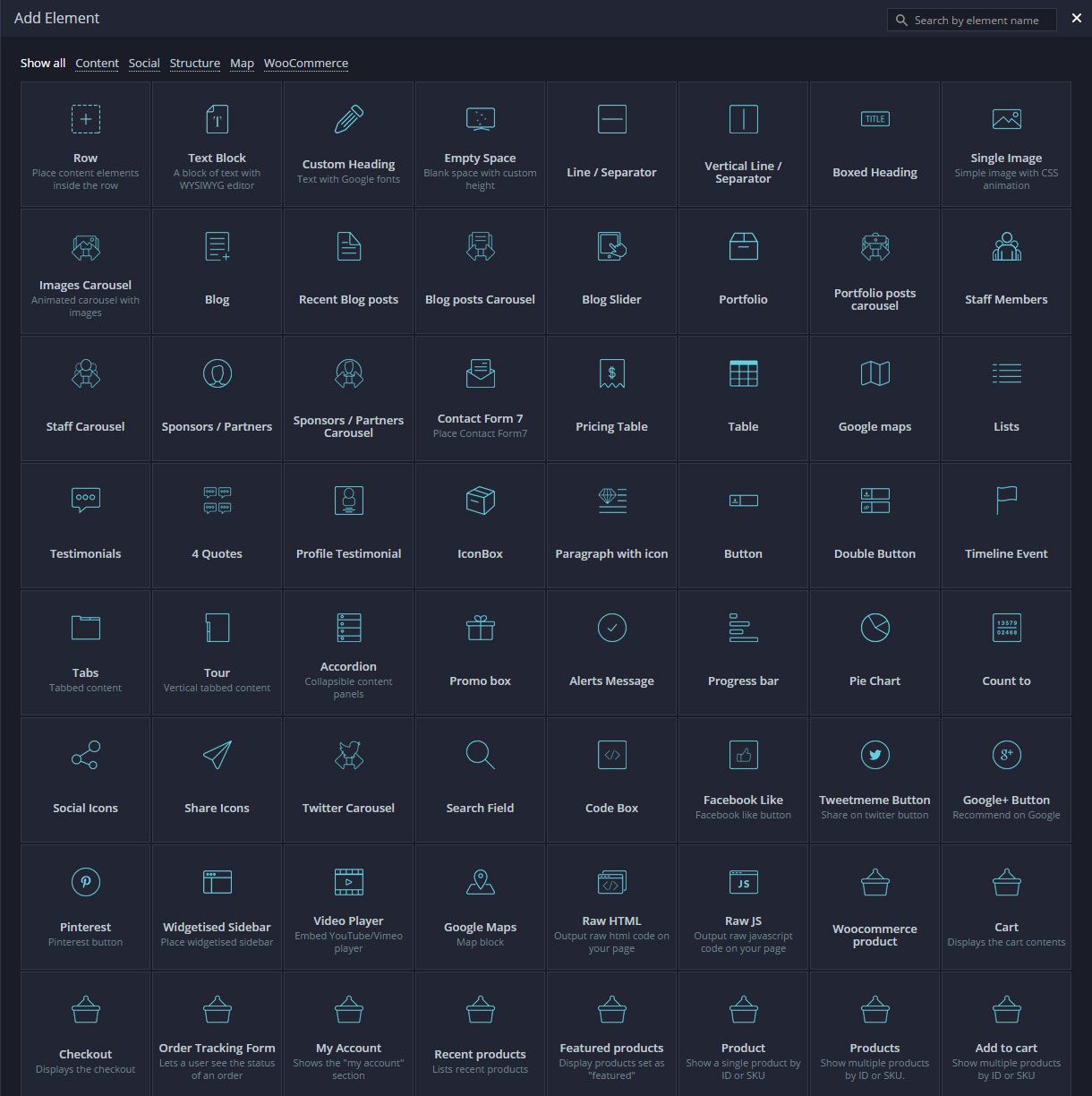
Step 4 - Click on the Add Element button  .
.
Step 5 - Select the Blog module. 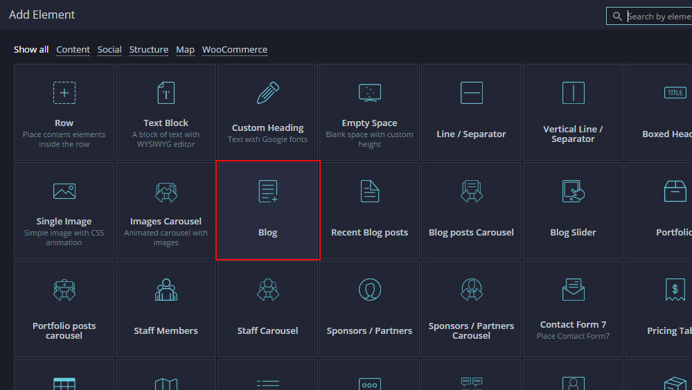
Step 6 - The Blog Settings should appear. You can customize the blog type and color by modifying the settings
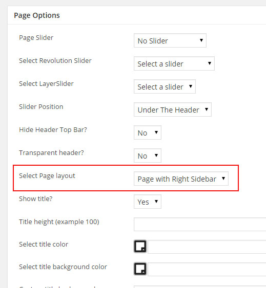
Step 7 - You can change the Page layout ( page with left or right sidebar ) from the page options, scroll down until you see the page options change the Page layout then publish the page
Blog settings
Post per page - Set the number of post you want to show on the page.
Blog Type - You can choose between 5 style: Standard, Grid, Masonry, Timeline, Multi Author. It will change the blog main design.
Thumbnail size - For Standard, Timeline, Multi Author you can choose between croped Thumbnail or Full size ( original size thumbnail ).
Number of Columns - For Grid and Masonry you can change the blog layout between 4, 3, 2 columns layout.
Category - You can filter the blog using category, select the category you want to show.
Color - Leave blank to use Color you set in theme options, but you can customize each color for the heading, text, highlight, hover, border, background.
Navigation Type - Select the navigation to use. Load More Button or Classic Navigation
Navigation Color - You can also customize the Navigation color if needed.
Create Portfolio page
Create Portfolio page
Follow the steps bellow to understand how to create a staff page.
Create Packery Layout Portfolio
We will explain how to create a Packery Layout Portfolio ( Thumbnail with different sizes ).
Create Full Width / Screen Portfolio
We will explain how to create a Full width Portfolio.
Portfolio settings
Explain the Portfolio module settings.
Create Portfolio page
Step 1 - Log in to your WordPress Administration Panel (Dasrdoard)..
Step 2 - Click on Pages > Add New.
Step 3 - Give your page a name then Change the Editor to Backend Editor ( you need to have the Visual Composer plugin activated ).
Step 4 - Click on the Add Element button 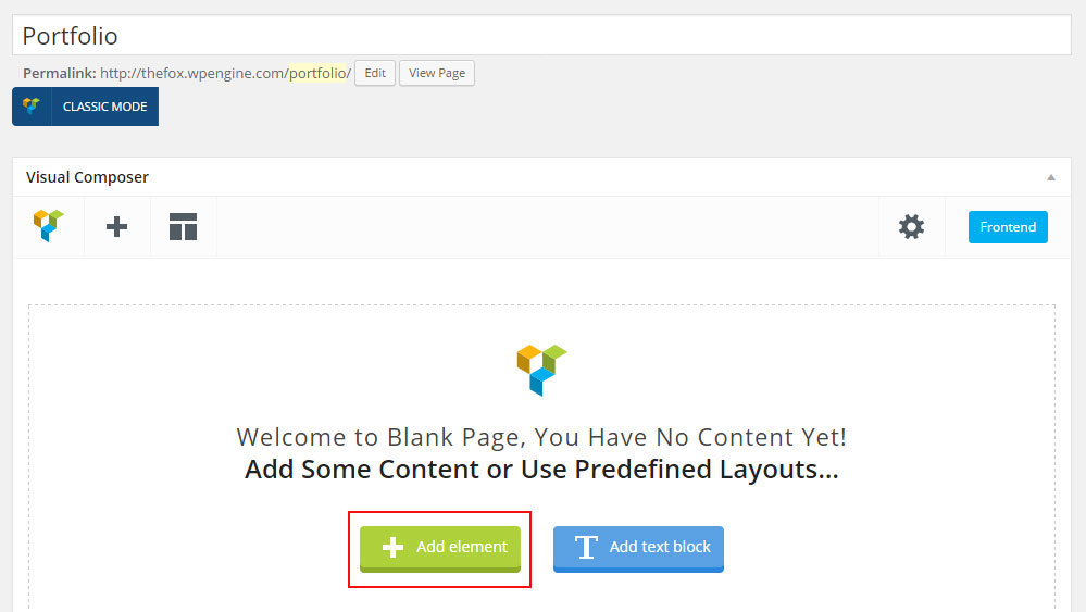
Step 5 - Select the Portfolio module. 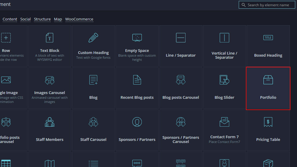
Step 6 - The Portfolio Settings should appear. You can customize the Portfolio type and color by modifying the settings
Step 7 - You can change the Page layout ( page with left or right sidebar ) from the page options, scroll down until you see the page options change the Page layout then publish the page
Create Packery Layout Portfolio
Step 1 - First Create a Page with the Portfolio Module.
Step 2 - Open the Portfolio Module setting.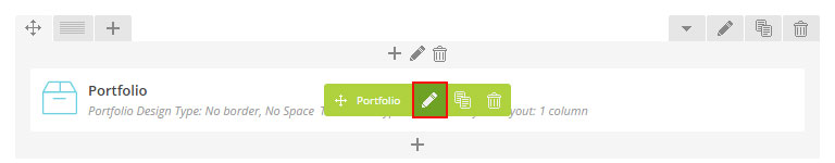
Step 3 - Change Portfolio Design type to No Border, No Space.
Step 4 - Change Thumbnail type to Packery Squared or Packery Rectangle.
Step 5 - Change Portfolio Layout to 4, 5 or 6 Columns.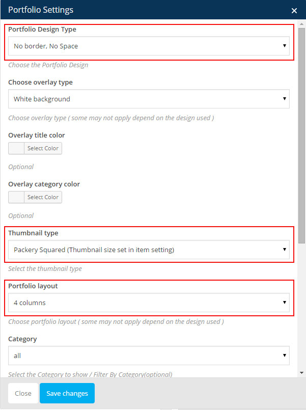
Step 6 - Click Saves Changes and publish / update your page
Step 7 - If your portfolio looks like a normal masonry ( view screenshot below ) you need to go edit your portfolio posts and change the Packery Layout Thumbnail Size option 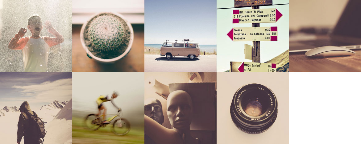
Step 8 - Go edit your Portfolio post options and change the Packery Layout Thumbnail Size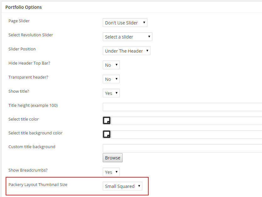 after updating your posts you should have a random / packery Layout like this
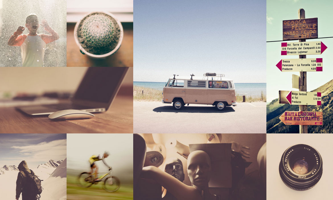
Create Full Width / Screen Portfolio
Step 1 - First Create a Page with the Portfolio Module. !! The Page must be without sidebar !!
Step 2 - Edit the Row that contains the Portfolio Module.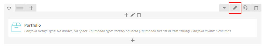
Step 3 - Change the Row Type to Full width Content.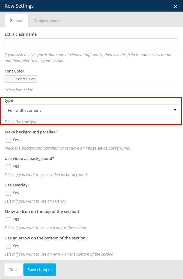
Step 4 (optional) - To make it completly full screen ( without white space ) Click on Design Options and change the Top Margin, Top Padding, Bottom Padding, Bottom Margin to 0.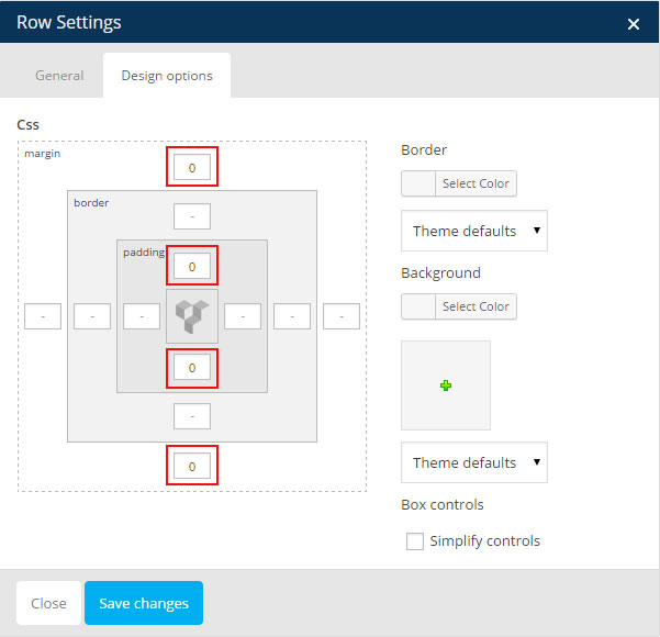
Step 5 - Click Saves Changes and publish / update your page
Portfolio Settings
Portfolio Design Type - Here you can choose the portfolio type ( design ).
Choose Overlay Type - You can choose between 11 overlay style, we will add more!
Thumbnail Type - Choose what size you want to use for your thumbnail.
Portfolio Layout - You can choose the portfolio layout between 1 to 6 columns.
Category - You can filter the portfolio using category, select the category you want to show.
Tag - You can filter the portfolio using tag, select the tag you want to show.
Number of post to load - This is the number of post to show on the page
Use filter - If you want to use a filter for the portfolio check this box
Navigation Type - Choose if you want: No navigation, Load more button or Classic Navigation for your portfolio.
Create Contact Form
Create Contact Form
TheFox use the contact form 7 plugin, check the steps below to see how to create the contact form.
Create Contact Page
We will explain how to use the form you just created in your page or post.
Contact Form 7 Documentation
Link to the Official Documentation of the Plugin.
Create Contact Form
Step 1 - Log in to your WordPress Dashboard, go to Contact > Add New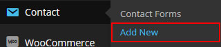
Step 2 - Give a Name to your form and change Mail Info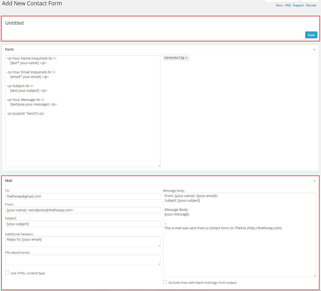
Step 3 - Edit the Form field to change the Form Layout ( if you want to use one of the layout you saw on the demo check the next step )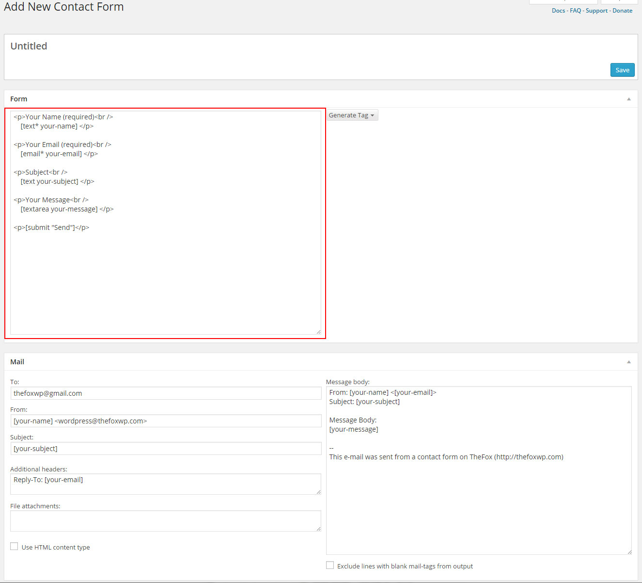
TheFox Form Layout - Click the link under the image to get the text you need to paste into your form field to create a form with the same layout ( design is set when you set your module )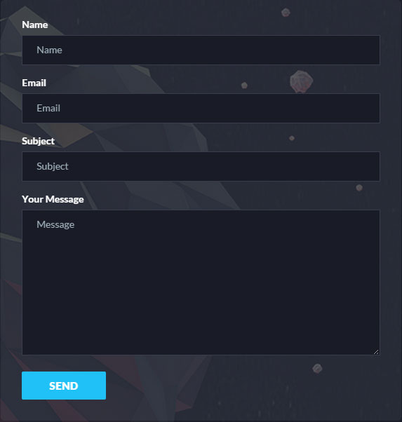 Click here to get the Text you need to copy
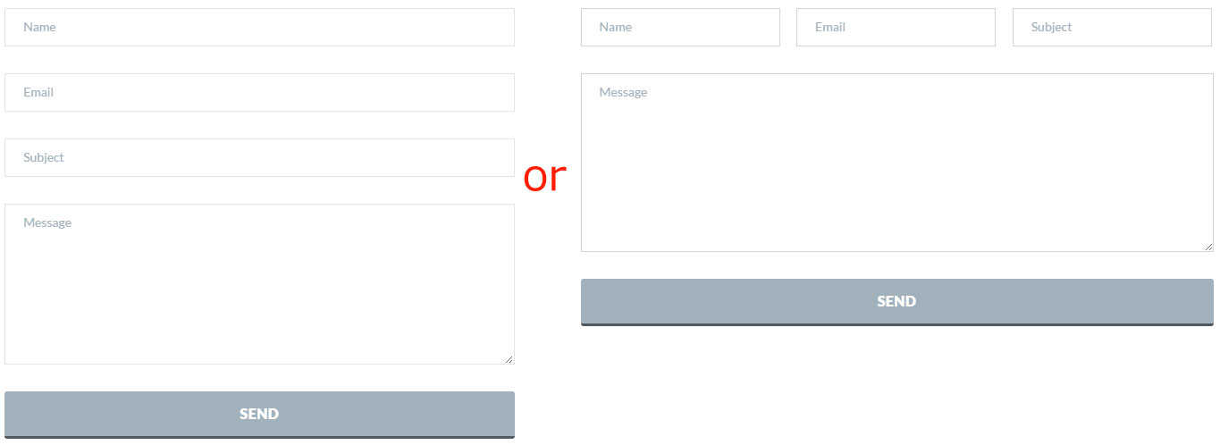 Click here to get the Text you need to copy
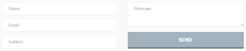 Click here to get the Text you need to copy
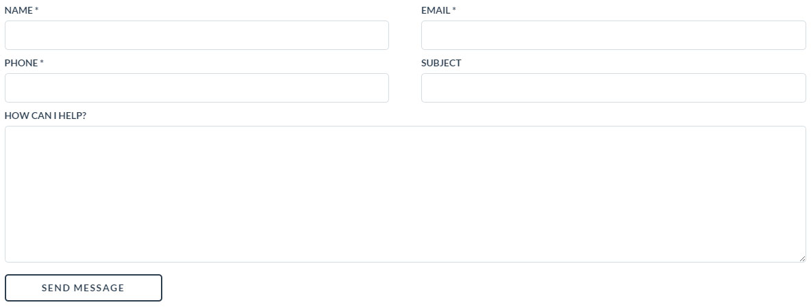 Click here to get the Text you need to copy
Step 4 - Save your Form 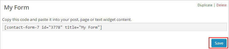
Create contact page
Step 1 - Log in to your WordPress Administration Panel (Dasrdoard)..
Step 2 - Click on Pages > Add New.
Step 3 - Give your page a name then Change the Editor to Backend Editor ( you need to have the Visual Composer plugin activated ).
Step 4 - Click on the Add Element button 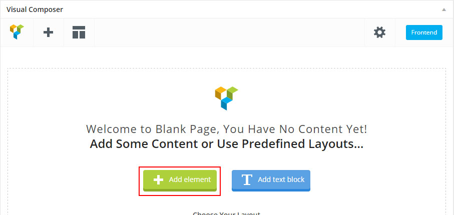
Step 5 - Select the Contact Form 7. 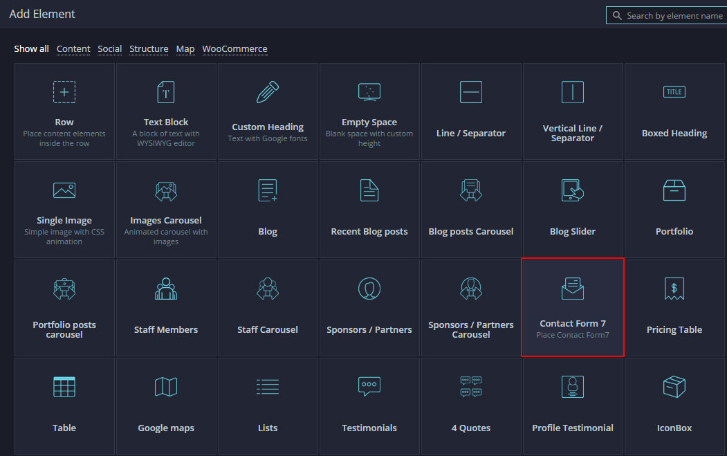
Step 6 - The Contact Form 7 Settings should appear. Select the Form you want to use you can also customize the Color and change the fields layout and button design
Step 7 - Update / Publish your page
Create Staff members
Adding Staff Members
How to create your team member post.
Adding Staff Members
Step 1 - Log in to your WordPress Administration Panel (Dasrdoard)..
Step 2 - Click the Staff Members > Add New.
Step 3 - Fill the title field with the staff member name, add a Group and Filter category if needed.
Step 4 - Add a featured image, it will represent your team member's image.
Step 5 - Scroll down until you see the staff member options panel. Set the Staff Member Position and Staff Member Description and other information.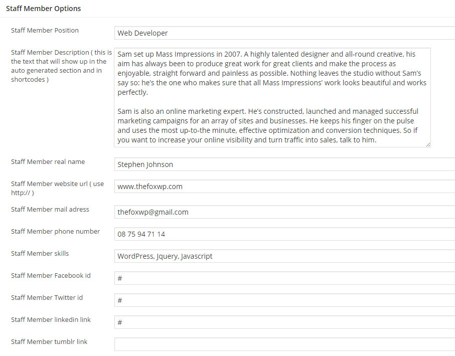
Step 6 - The content is optional, it will appear under the staff main information. Check the screenshot below to see how staff post works. 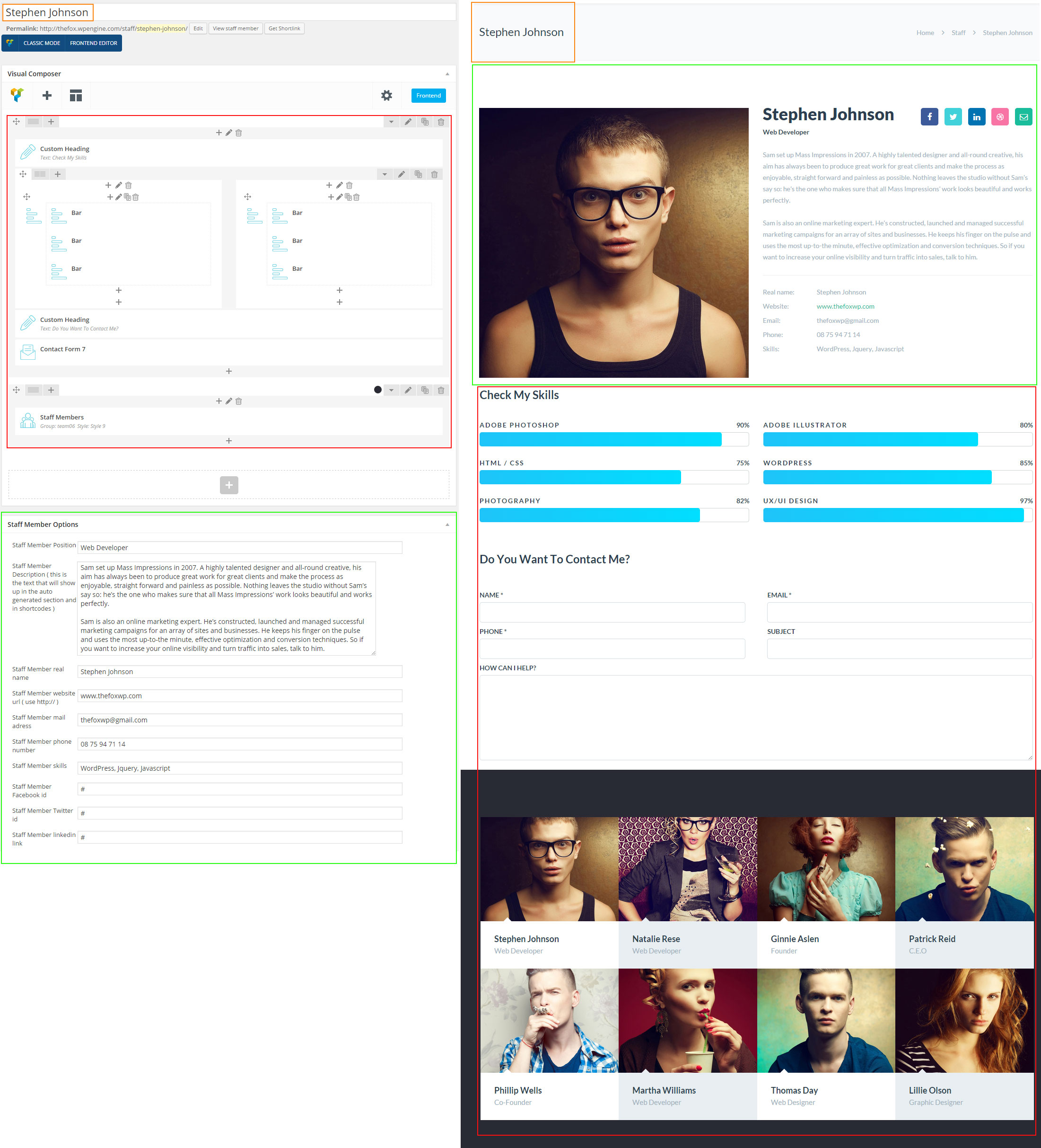
Step 7 - If you want to change the Staff member order you will need to change the publish time.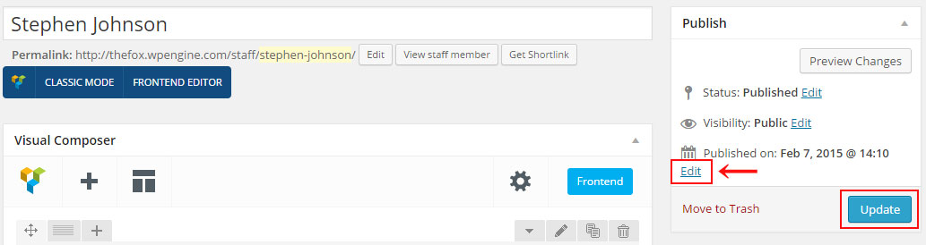
Showing Staff Members
You need to use the Staff module in order to list your staff members.
Check the staff module page for more information
Create Staff page
Create Staff page ( standard )
We will explain how to create a staff page.
Create Staff page ( carousel )
We will explain how to create a staff page using Carousel.
Create Full Width / Screen Portfolio
We will explain how to create a Full width Portfolio.
Staff Members settings
Explain the Staff Members module settings.
Staff Carousel settings
Explain the Staff Carousel module settings.
Create Staff page ( standard )
Step 1 - Log in to your WordPress Administration Panel (Dasrdoard)..
Step 2 - Click on Pages > Add New.
Step 3 - Give your page a name then Change the Editor to Backend Editor ( you need to have the Visual Composer plugin activated ).
Step 4 - Click on the Add Element button 
Step 5 - Select the Staff Members module. 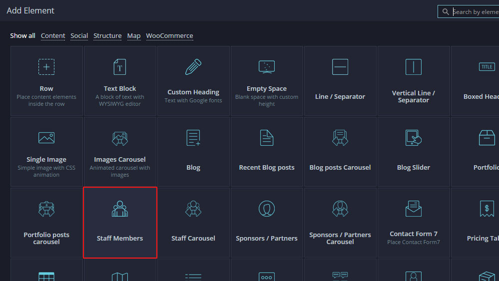
Step 6 - The Staff Members should appear. You can customize the Staff type and color by modifying the settings
Step 7 - You can change the Page layout ( page with left or right sidebar ) from the page options, scroll down until you see the page options change the Page layout then publish the page
Create Staff page ( carousel )
Step 1 - Log in to your WordPress Administration Panel (Dasrdoard)..
Step 2 - Click on Pages > Add New.
Step 3 - Give your page a name then Change the Editor to Backend Editor ( you need to have the Visual Composer plugin activated ).
Step 4 - Click on the Add Element button
Step 5 - Select the Staff Carousel module. 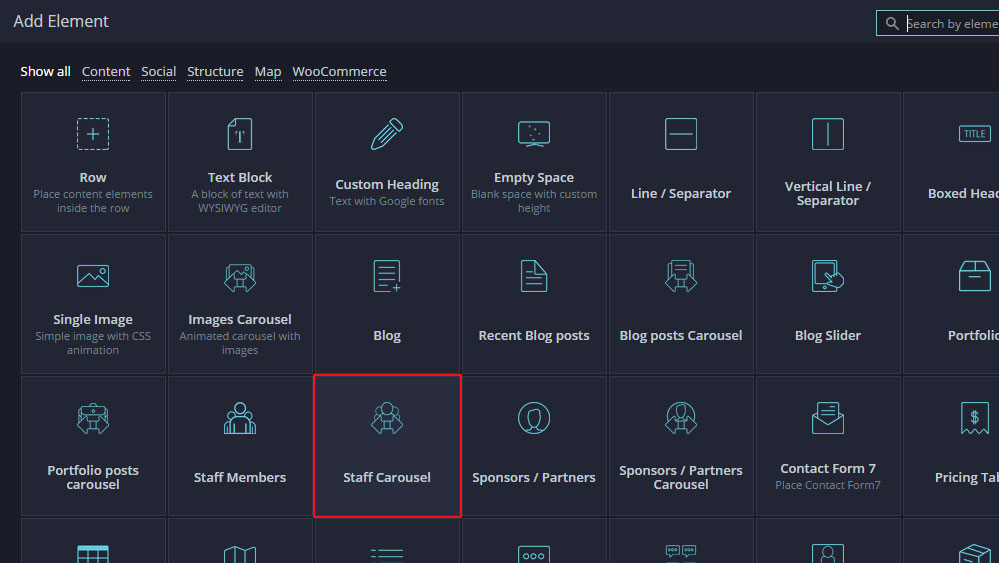
Step 6 - The Staff Carousel should appear. You can customize the Staff type and color by modifying the settings
Step 7 - You can change the Page layout ( page with left or right sidebar ) from the page options, scroll down until you see the page options change the Page layout then publish the page
Create Full Width / Screen Staff Page
Step 1 - First Create a Page with the Staff Members Module, the style setting should be style 7 or style 9. !! The Page must be without sidebar !!
Step 2 - Edit the Row that contains the Staff Members Module.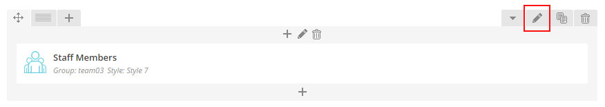
Step 3 - Change the Row Type to Full width Content.
Step 4 (optional) - To make it completly full screen ( without white space ) Click on Design Options and change the Top Margin, Top Padding, Bottom Padding, Bottom Margin to 0.
Step 5 - Click Saves Changes and publish / update your page
Staff Members Settings
Number of Staff to load - Choose the number of Staff to show on page.
Group - You can choose the Group ( category ) of member to show
Style - You can choose the Staff members design.
Number of columns - Choose the number of columns ( layout ).
Colors options - You can edit Color for each design.
Navigation type - You select what navigation to use: No navigation, Load more button or Classic Navigation.
Use filter? - If you want to use a Filter for your Staff page
Staff Members Carousel Settings
Carousel Style - Choose the Carousel Style ( Design )
Group - You can choose the Group ( category ) of member to show
Posts per line - Choose the number of Staff member to show per line ( column / layout )
Number of staff member to load - Choose the number of Staff Member to load.
Colors options - You can edit Color for each design.
Create Partners post
Create Partners post
Partners post are great to show the partners / sponsors you have or to show people / company you worked with.
Show Partners on your page ( standard )
We will explain how to show your partners / sponsors on your page.
Show Partners on your page ( carousel )
We will explain how to show your partners / sponsors carousel on your page.
Create Partners post
Step 1 - Log in to your WordPress Administration Panel (Dasrdoard)..
Step 2 - Click on Partners > Add New.
Step 3 - Give your post a name then scroll down until you see the Partners options box.
Step 4 - Add a link using http:// (optional)
Step 5 - Add a Group to be able to filter the Partner ( optional )
Step 6 - Add the company logo as featured image by clicking Set featured image.
Step 7 - Publish the post. 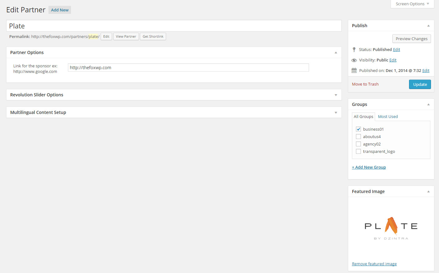
Show Partners post ( standard )
Step 1 - Log in to your WordPress Administration Panel (Dasrdoard)..
Step 2 - Click on Pages > Add New.
Step 3 - Give your page a name then Change the Editor to Backend Editor ( you need to have the Visual Composer plugin activated ).
Step 4 - Click on the Add Element button
Step 5 - Select the Sponsors / Partners module 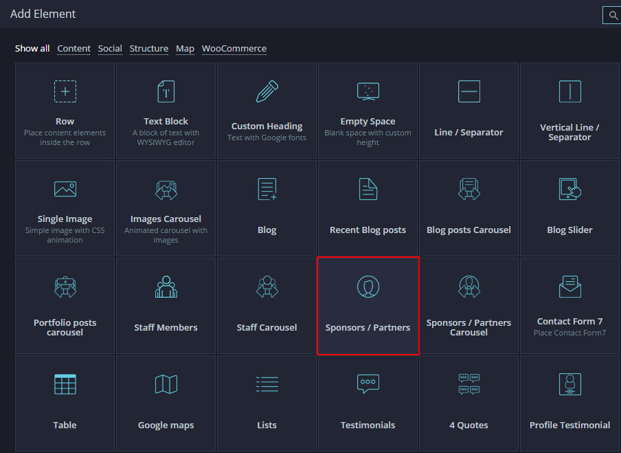
Step 5 - Select the Number of post to load, the number of columns, the group to show then save changes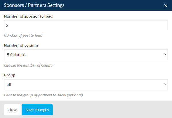
Step 6 - Publish / Update your page
Show Partners post ( carousel )
Step 1 - Log in to your WordPress Administration Panel (Dasrdoard)..
Step 2 - Click on Pages > Add New.
Step 3 - Give your page a name then Change the Editor to Backend Editor ( you need to have the Visual Composer plugin activated ).
Step 4 - Click on the Add Element button
Step 5 - Select the Sponsors / Partners Carousel module 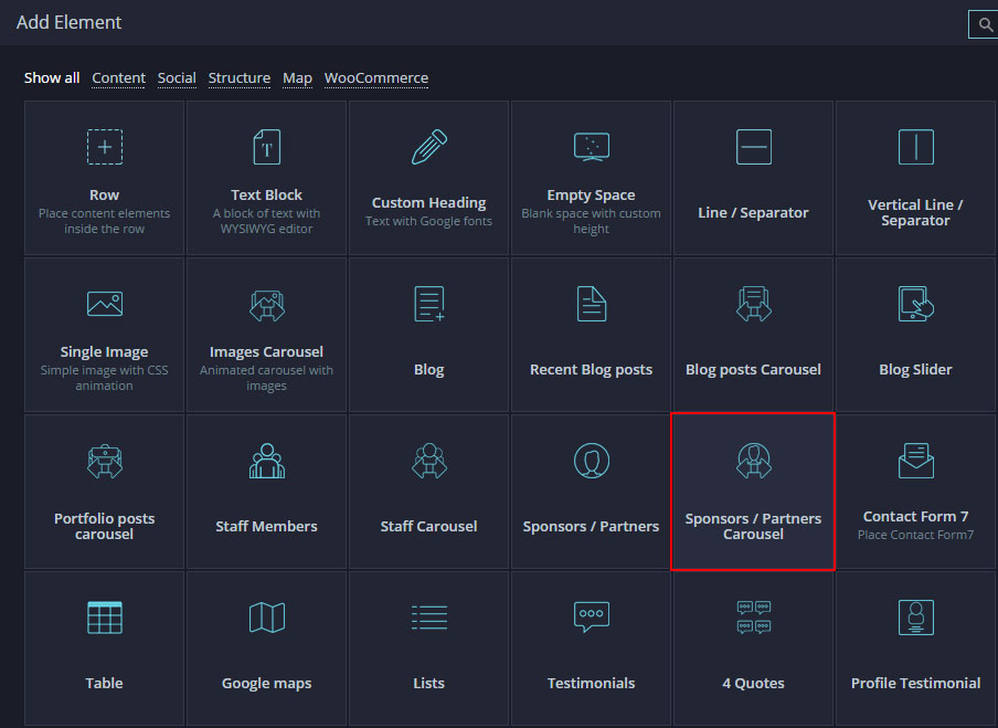
Step 5 - Select the Number of post to load, the number of post per line, the group to show then save changes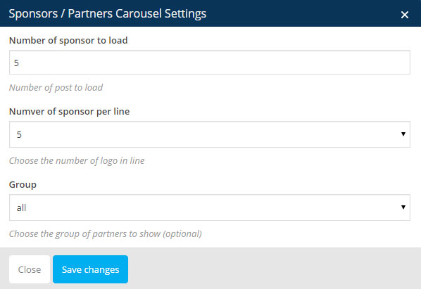
Step 6 - Publish / Update your page
Theme Options
The theme comes with an extensive Theme Options Panel. From the Theme options panel you will be able to set or change the color of the theme, layout, header style, social icons and a lot more. You should take the time to go through all of these options to ensure that you are getting the most out of the theme. Click TheFox to access the Theme Options Panel.
General setting
Dark Logo upload - Upload a logo for your website, will be used on normal page.
Light Logo upload - Upload a Light logo for your website, will be used on page using transparent header.
Logo width - Set your logo size, dont include px only number ex: 155
Favicon upload - You can upload a favicon for your website, need to be a 32px x 32px Png/Gif .
Enable Responsive Design - Select if you want to enable or disable responsive design.
Smooth Scrolling - Select if you want to enable or disable the Smooth Scrolling.
Tracking Code - Paste your google analytics or other tracking code.
FeedBurner URL - Enter your full FeedBurner URL (or any other preferred feed URL) if you wish to use FeedBurner over the standard WordPress Feed e.g. http://feeds.feedburner.com/yoururlhere.
Styling Options
Enable Boxed Layout - You can Choose between Boxed and Wide layout and additional options will show up when you choose "boxed".
Customs Css - You can write custom CSS in this field.
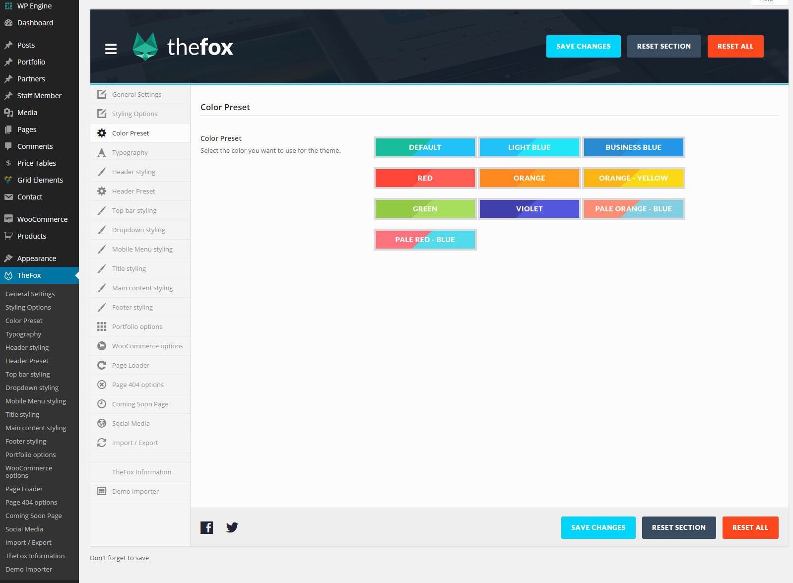
Color Preset
Color preset - Select a color preset if you want to use pre definied color
Typography
Use Custom fonts for body? - Select Yes if you want to use custom font for the body
Use Custom fonts for Menu / Header? - Select Yes if you want to use custom font for the Header and Dropdown.
Use Custom fonts for Headings? - Select Yes if you want to use custom font for the Heading H1 - H6.
Header styling
Select the logo to use - Choose the Logo to use Dark or Light Logo.
Header layout - Choose between 18 Header's layout / design.
Header Background color - Choose the Header's background color.
Menu Text color - Choose the Menu's text color.
Menu Background color - Choose the Menu's background color.
Current Menu Text color - Choose the Current Menu's text color.
Current Menu Background color - Choose the Current Menu's background color.
Header border color - Choose the Header's border color.
Display "Search" icon in the header? - Select yes if you want to display the search icon in the header.
Display Cart icon in the header? - Select yes if you want to display the cart icon in the header.
Top bar styling
Use Header Top Bar? - Select yes if you want to have a top bar on the top of the header.
Topbar style - Select the topbar style.
Top bar Background Color - Select the Top bar background color.
Top bar Text Color - Select the Top bar text color.
Top bar Second text color - Select the Top bar second text color.
Top bar Highlight Color - Select the Top bar highlight color.
Top bar border Color - Select the Top bar border color.
Top bar TOP border Color - Select the Top bar TOP border color.
Display phone number in the top bar? - To display the phone number field in the top bar select yes.
Enter your phone number - Text to display next to the phone icon.
Display email in the top bar? - To display the email field in the top bar select yes.
Enter your email - Text to display next to the mail icon.
Display news text in the top bar? - To display the news field in the top bar select yes.
Enter some text to display in the top bar - Text to display next to the news icon.
Display social icon? - Turn on to display social Icon.
Icon position - Select the icon position Left or Right.
Display an additional menu in the top bar? - If you want to use an additional menu in the top bar select yes
Display "Login / Register" button? - If you use woocommerce you can display login and register button in top bar
Display "Choose language" in the top bar? - If you use WPML you can display choose language dropdown in top bar
Dropdown styling
Dropdown Background Color - Choose the Background color for dropdown.
Dropdown Heading Color - Choose the Heading Color for the dropdown.
Dropdown Text Color - Choose the Text Color for the dropdown.
Dropdown highlight color - Choose the Highlight Color for the dropdown.
Hover color for dark element - Choose the Hover color for dark element for the dropdown.
Hover color for light element - Choose the Hover color for light element for the dropdown.
Dropdown border color - Choose the Border color for the dropdown.
Mobile Menu styling
Mobile Menu Text color - Choose the Text color for the Mobile Menu.
Mobile Menu Highlight color - Choose the Highlight Color for the Mobile Menu.
Mobile Menu Icon color - Choose the Icon Color for the Mobile Menu.
Mobile Menu Background Color - Choose the Background Color for the Mobile Menu.
Current page Background Color - Choose the Background Color for Mobile Menu Current page.
Submenu page Background Color - Choose the Background Color for Mobile Menu Submenu Page.
Mobile Sub Menu Icon color - Choose the Icon color for Mobile menu Submenu.
Sub-Submenu page Background Color - Choose the Background color for Mobile menu Sub-Submenu.
Sub-Submenu Text Color - Choose the Text color for Mobile menu Sub-Submenu.
Title Styling
Title Background Color - Choose the Background Color for the Title.
Title Text Color - Choose the Text Color for the Title.
Title border color - Choose the Border Color for the Title.
Breadcrumbs Color - Choose the Breadcrumbs Color.
Breadcrumbs button background Color - Choose the Breadcrumbs button background Color.
Breadcrumbs button text and border Color - Choose the Breadcrumbs button text and Border Color.
Main content Styling
Main content background color - Choose the Main content Background Color.
Main content Heading Color - Choose the Main content Heading Color..
Main content Text Color - Choose the Main content Text Color
Main content highlight color - Choose the Main content highlight color.
Hover color for dark element - Choose the Hover Color for the dark element.
Hover color for light element - Choose the Hover Color for the light element.
Main content border color - Choose the Main content border color.
Main content grey field color - Choose the Main content Grey field color.
Alternative Background Color - Choose the Alternative Background Color for the Main content.
Alternative Heading Color - Choose the Alternative Heading Color.
Alternative Text Color - Choose the Alternative Text Color for the Main content.
Alternative highlight color - Choose the Alternative Highlight color for the Main content.
Alternative hover color for dark element - Choose the Alternative hover color for Dark Element.
Alternative hover color for light element - Choose the Alternative hover color for the Light Element.
Alternative border color - Choose the Alternative Border color for Main Element.
Footer styling
Show Footer? -Select if you want to show the Footer.
Footer columns number - Choose the Footer columns number ( footer layout )
Footer style - Choose the Footer style ( design )
Footer Background Color - Choose the Footer Background Color
Footer Heading Color - Choose the Footer Heading Color
Footer Text Color - Choose the Footer Text Color
Footer highlight color - Choose the Footer Highlight Color
Footer hover color - Choose the Footer Hover color
Footer border color - Choose the Footer Border color
Use Under Bar - Select if you want to use footer under bar
Show custom text ? - Select if you want to show custom text in the footer under bar
Custom text position - Select the text position
Text to display in footer under bar - Enter the text you want to display in the footer under bar
Show Social icons in the bar? - Select if you want to show Social icons in the footer under bar
Social Icons positions - Select the Social Icons positions
Social Icons style - Select the Social Icons style
Show menu in the bar? - Select if you want to show a menu in the footer under bar
Menu position - Select the Menu Position
Menu style - Choose the Menu Style
Under bar Background Color - Choose the Footer Under bar Background Color
Under bar Heading Color - Choose the Footer Under bar Heading Color
Under bar Text Color - Choose the Footer Under bar Text Color
Under bar highlight color - Choose the Footer Under bar Highlight Color
Under bar hover color - Choose the Footer Under bar Hover Color
Under bar border color - Choose the Footer Under bar Border Color
Portfolio options
URL to your Main Portfolio Page - Put your portfolio page URL, needed for portfolio breadcrumbs
Portfolio breadcrumbs name - Select the text to show for the portfolio breadcrumbs
Custom Slug - If you want to change the portfolio slug, if you change the slug update the permalinks
WooCommerce options
Shop page layout - Select the number of columns for the shop page
Item per page - Enter the number of items you want to show per page.
Page Loader
Use Page Pre-Loader? - Select if you want to use Page Pre-Loader
Select the Loader main color - Select the Loader main color ( Light / Dark )
Select the Loader type ( Design ) - Select the Loader type ( Simple / Complex )
Loading bar first color - Choose the Loader bar First Color
Loading bar second color - Choose the Loader bar Second Color
Loader Logo upload - For Complex Pre-Loader Upload a Logo
Spinning bar first color - Choose the Spinning bar First Color
Spinning bar second color - Choose the Spinning bar Second Color
Spinning bar third color - Choose the Spinning bar Third Color
Spinning bar ball color - Choose the Spinning bar Ball Color
Page 404 options
Page 404 Title - Select the Page 404 Title
Page 404 Error Text - Select the Page 404 Main Error text
Page 404 Error Sub-Text - Select the Page 404 Sub Error text
Page 404 image - If you want upload a custom Image for the Page 404
Coming Soon Page
Select the Coming Soon Page Style ( Design ) - Select the Loader main color ( Light / Dark )
Loading bar first color - Choose the Loader bar First Color
Loading bar second color - Choose the Loader bar Second Color
Loading bar third color - Choose the Loader bar Third Color
Spinning bar ball color - Choose the Spinning bar Ball Color
Coming Soon Page Logo upload - Upload a Logo for the Coming soon page
Coming Soon Page Text - Put the Text to display on Coming soon page
Date - Input the Date form yyyy-mm-dd ( 2017-04-16 )
Text For Days - Choose the Text for Days countdown
Days Counter Bar color - Choose the Color for Days Countdown
Text For Hours - Choose the Text for Hours countdown
Hours Counter Bar color - Choose the Color for Hours Countdown
Text For Minutes - Choose the Text for Minutes countdown
Minutes Counter Bar color - Choose the Color for Minutes Countdown
Text For Seconds - Choose the Text for Seconds countdown
Seconds Counter Bar color - Choose the Color for Seconds Countdown
Use Mail Form? - Select if you want to use a Mail form
Email - Choose the Spinning bar Third Color
Email Subject - Email Subject ( Title of the mail coming to your mail box )
Form Placeholder - Put the text user will see before they enter their email
Social media
Select social icon to show - Fill the Social icons you want to show with your URL
Demo Importer
Demo Importer - Click on the demo you want to import
Page Options
For each page you can change the title style, title background color, select to use a slider and much more! Check the screenshot and read the documentation to see how it works
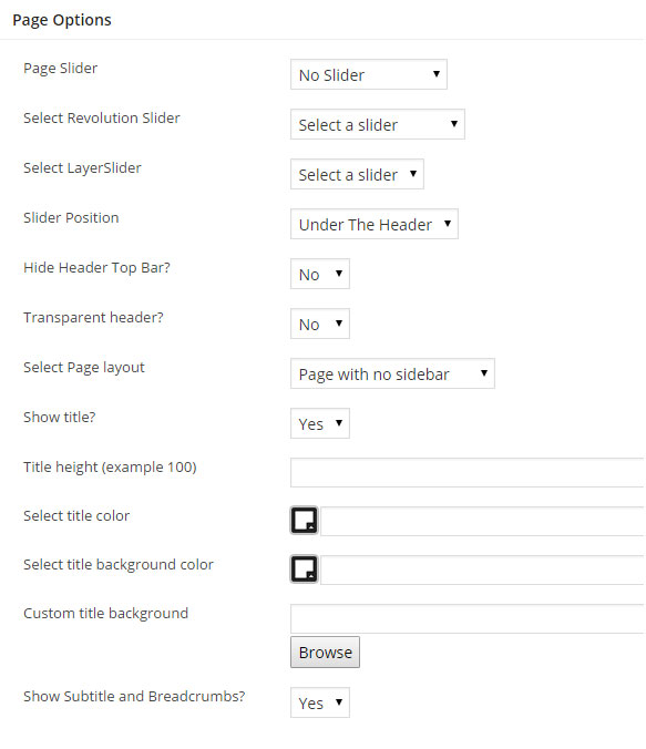
Page Slider - Select if you want to use a Revolution or Layer Slider
Select Revolution / Layer Slider - Select the slider to show for the page
Slider Position - Select the slider position, under or above the header
Hide Header Top Bar? - Select if you want to hide the Header top bar
Transparent header - Select if you want to make the header transparent
Select page layout - Select if you want the page to have a Right Sidebar / Left Sidebar / No Sidebar.
Show Title - Select to show or hide the title ( good to hide the title when using
Select title height - Choose the height of the header ( example : 400 )
Select title color - Select the title text color.
Select title background color - Select the title background color.
Custom title background - You can upload an image to use as the title background.
Show Breadcrumbs? - Select if you want to show the subtitle and breadcrumbs.
Post Options
For each post you can change the title style, title background color, select to use a slider and much more! Check the screenshot and read the documentation to see how it works
Page Slider - You can use a Revolution or Layer Slider top show on the Post page
Select Revolution / Layer Slider - Select the Slider you want to use for the post
Slider Position - Select if the Slider should be above or under the header
Hide Header top bar - Select if you want to hide the header top bar for this post
Transparent Header - Select if you want to use a Transparent Header for this post
Show title - Select if you want to show or hide the post title section
Title Color - If you want to change the title text color
Title Background Color - If you want to change the title background color
Custom Title Background - If you want to use an image for the title background, you can upload an image or use an image link
Show Slider / Video / Audio on the top of the post - Select if you want to show or hide the featured image / gallery / video / audio / quote on the top of the post
Show Breadcrumbs - Select if you want to hide or show the breadcrumbs
Video Embed Code - Fill this field to make the video appear on top of your post
Quote text - Fill this field to make the quote text appear on top of your post
Quote author name - Fill this field to make the quote author name to appear on top of your post
Select Post Layout - Select the post Layout. Post with Right, Left or No Sidebar
Show Share Buttons - Select if you want to show or hide the share button
Show Author Biography - Select if you want to show or hide the Author Biography
Show Related Post - Select if you want to show or hide the Related post carousel
Portfolio Post Options
For each portfolio post you can change the title style, title background color, select to use a slider and much more! Check the screenshot and read the documentation to see how it works
Page Slider - You can use a Revolution or Layer Slider top show on the Post page
Select Revolution / Layer Slider - Select the Slider you want to use for the post
Slider Position - Select if the Slider should be above or under the header
Hide Header top bar - Select if you want to hide the header top bar for this post
Transparent Header - Select if you want to use a Transparent Header for this post
Show title - Select if you want to show or hide the post title section
Title Color - If you want to change the title text color
Title Background Color - If you want to change the title background color
Custom Title Background - If you want to use an image for the title background, you can upload an image or use an image link
Show Breadcrumbs - Select if you want to hide or show the breadcrumbs
Packery Layout Thumbnail Size - Select The Post Thumbnail size when used in Portfolio Packery Layout
Project Layout - Select the Post Layout, Half Width or Full width
Project Subtitle - Fill this field to add a subtitle to the project
Client name - Fill this field to make the client name appear on the project
Project url - Fill this field to make the project url appear on the project and will also add a button linked to the project
Show Share Buttons - Select if you want to show or hide the share button
Show Author Biography - Select if you want to show or hide the Author Biography
Show Related Post - Select if you want to show or hide the Related post carousel
Video Embed Code - Fill this field to make the video appear on top of your post
Page Builder
TheFox comes with the Premium Plugin Visual Composer, we modified the plugin and added module to give the user the possibility to create all the page and post using only the Visual Composer, no code needed.
We have 75 Modules ( include WooCommerce, Revolution Slider, Layer Slider module ).
To learn how to use the page builder check How to Use Page builder Section
To see all Module Detailed Settings check Page builder Modules
Shortcode Manager
TheFox comes with a Shortcode manager, when using the WordPress editor or Page builder text block module you can find the Shortcode manager icon "TheFox Logo Icon" in the WordPress TinyMCE.
Step 1 - Go to your Page or Post.
Step 2 - Click the "Arrow next to the TheFox Icon.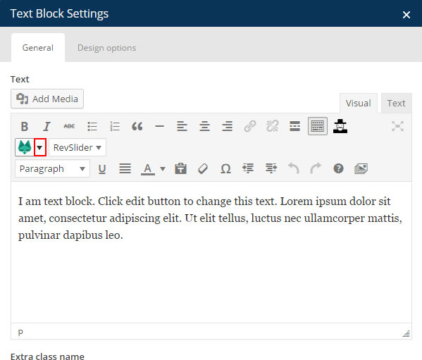
Step 3 - Then select the shortcode you want to use from the list, the shortcode setting will appear in a popup
Step 5 - Fill in the offered options and hit the Insert shortcode button. ( following screenshot show the Button shortcode setting )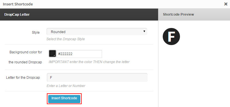
Price Tables
With TheFox you can create Price tables. I will explain how to create and use price tables.
Step 1 - Log in to your WordPress Administration Panel (Dasrdoard).
Step 2 - Click on Price tables > Add New.
Step 3 - Give a name to your price table then scroll down until you see the price table panel.
Step 4 - Click the 'Add column' to create a new table then fill the field needed ,to add new feature click add, To make a Recommended / featured table check Recommend Check the following screenshot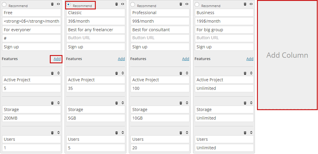
Step 5 - Click on Publish.
Step 6 - Go edit your page or post and use the PriceTables Module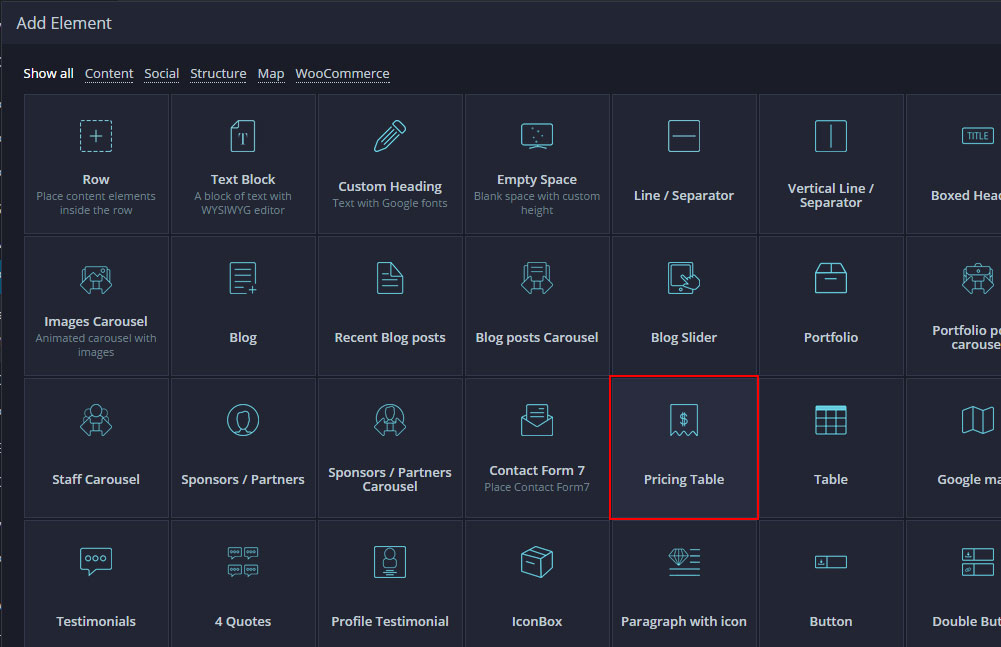 .
.
Step 7 - Select the Style (design) and the PriceTable your want to use. You can also add Margin and animation, edit the color if needed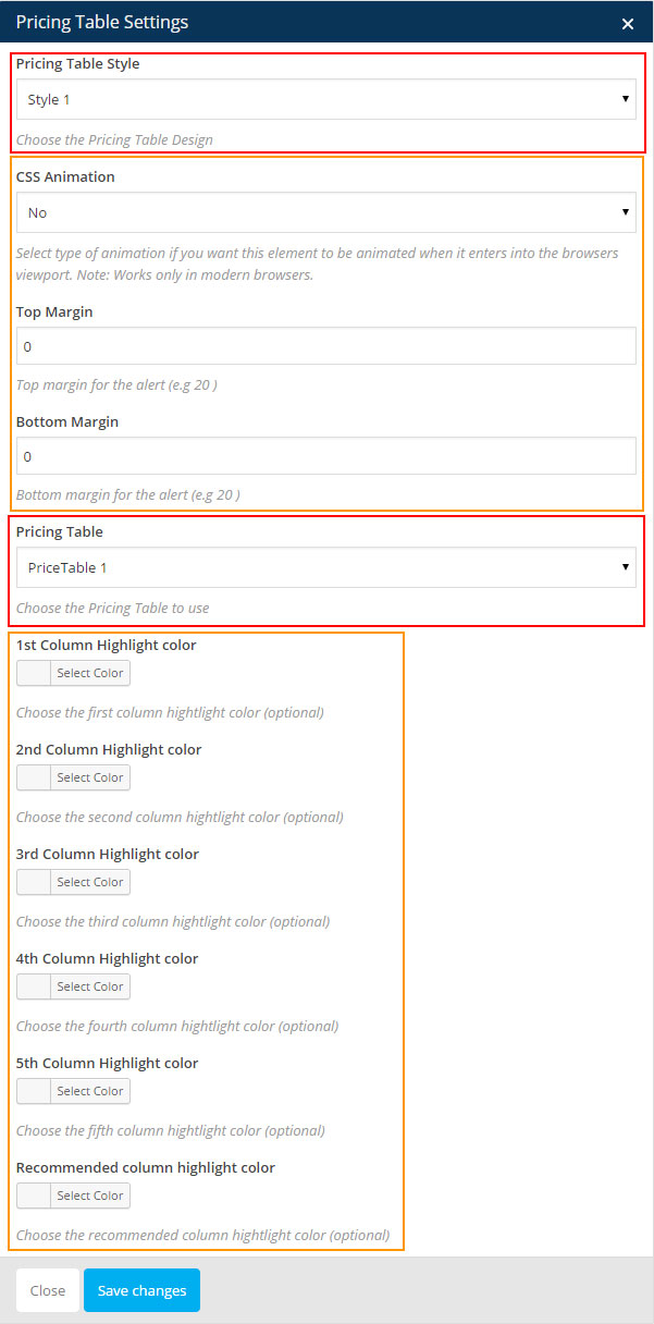
Step 8 - Update / Publish your page
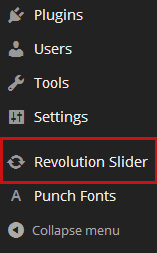
Revolution Slider
TheFox theme includes the premium plugin - Revolution Slider.
Once you've installed and activated the Revolution Slider plugin, you will then see the menu item appear at the bottom of the WordPress menu, as below:
Documentation
You can import the revolution slider we used in our demo, all slider are in the slider folder. To learn more about the Revolution Slider plugin please read the Plugin documentation
Layer Slider
TheFox theme includes the premium plugin - Layer Slider.
Once you've installed and activated the Layer Slider plugin, you will then see the menu item appear at the bottom of the WordPress menu.
Documentation
To learn more about the Layer Slider plugin please read the Plugin documentation
Features
Widgets
TheFox theme comes with Custom widget created specially for the theme.
To set the Widget go to Appearance > Widgets.
Included Widgets:
- Partners Carousel
- Recent Post Carousel
- Recent Portfolio Carousel
- Custom Twitter Widget
- Sidebar, Footer Recent Posts Widget
- Sidebar or Footer Portfolio widget
- Custom Google map
Additional Links:
Page builder Modules
Row
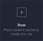
Create a new Row ( section ) on the page, Full width Row can't be used on page with sidebar
To learn more about Row and Column check the :
How to use page builder
Create full width section
Create parallax / video section
Row Options
Extra class name - If you wish to style particular content element differently, then use this field to add a class name and then refer to it in your css file.
Font Color - Select the font color for the row.
type - Select if you want the row to be in container / full width background / full width content.
Make background parallax? - If you want to make background parallax ( need to have a image set up as background ).
Use video as background? - if you want to use a video as background.
Use Overlay? - if you want to use an overlay for the row background.
Show an Icon on the top of the section? - if you want to show an icon at the top of the section.
Use an arrow on the bottom of the section? - if you want to use a icon at the bottom of the section.
Design Options - To edit the padding and margin and border, check How to use page builder to learn more about design options
Text Block
Create a Text Block ( WordPress editor ) on the page
To learn more about Text Block check the :
How to use page builder
Text Block Options
Extra class name - If you wish to style particular content element differently, then use this field to add a class name and then refer to it in your css file.
Font size - Select the font size (eg : 18 ).
Line height - Select the font line-height.
CSS Animation - Select an animation if needed.
Design Options - To edit the padding and margin and border, check How to use page builder to learn more about design options
Custom Heading
Create a Heading on the page, This is the main module you need to use to create title
To learn more about Custom Heading check the :
How to use page builder
Custom Heading Options
Text - This is the text for your title, you can use strong,span,a tag.
Element tag - select the Element tag, from h2 to h6, h2 and h3 are good to use for main title.
Text align - Select the text alignment.
Font size - Select the font size. For most of the title TheFox use 36px.
Line height - Select the line height, if using big title you may need to use this field, dont forgot the px eg : 40px .
Text Color - Select the heading color.
Font Family - Select the font family, TheFox use LATO.
Font Style - Select the font weight, light, regular,bold etc.
Extra class name - If you wish to style particular content element differently, then use this field to add a class name and then refer to it in your css file.
Design Options - To edit the padding and margin and border, check How to use page builder to learn more about design options
Empty Space
Create an Empty space on the page, great to use if you want to add space between elements.
Empty space Options
Height - Select the height of the empty space eg: 32px .
Extra class name - If you wish to style particular content element differently, then use this field to add a class name and then refer to it in your css file.
Line / Separator
Create a Line / separator on the page, for example check Divider shortcode page.
Line / Separator Options
Line type - Select the Line Design ( normal, double, dotted etc )
Line Color - Select the Line Color.
Use icon? - Select if you want to use an Icon for the Line.
Line Width - Select the line width, leave blank for full width.
Line position - Select the line position, left - center - right.
Top Margin - Add Top margin if needed, eg 20
Bottom Margin - Add Bottom margin if needed, eg 20
Vertical Line / Separator
Create a Vertical Line on the page, for example check Personal Page.
Vertical Line / Separator Options
Line Color - Select the Line Color.
Line Height - Select the height of the Line, eg : 300 .
Top Margin - Add Top margin if needed, eg 20
Bottom Margin - Add Bottom margin if needed, eg 20
Boxed Heading
Create an Boxed Heading on the page
Boxed Heading Options
CSS Animation - Select an animation if needed.
Heading text - Select the text for the heading.
Heading Color - Select the heading color.
Heading Background Color - Select the heading background color.
Heading Border Color - Select the heading border color.
Heading Bottom Border Color - Select the heading bottom border color.
Top Margin - Add Top margin if needed, eg 20
Bottom Margin - Add Bottom margin if needed, eg 20
Single Image
Show an Image on the page.
To learn more about Single image design options check the :
How to use page builder
Single Image Options
Widget title - Enter text which will be used as widget title. Leave blank if no title is needed.
Image - Upload your Image
Image size - Enter image size. Full for full width . Alternatively enter image size in pixels: 200x100 (Width x Height). Leave empty to use "thumbnail" size.
Image alignment - Select image alignment.
Image style - Select display style.
Link to large image? - If selected, image will be linked to the larger image.
Image link - Use this field to make a link for the image
Extra class name - Enter prettyphoto to make the image open in Lightbox
Hover effect - Select the hover effect for the image
CSS Animation - Select an animation if needed.
Design Options - To edit the padding and margin and border, check How to use page builder to learn more about design options
Images Carousel
Create an Images Carousel on the page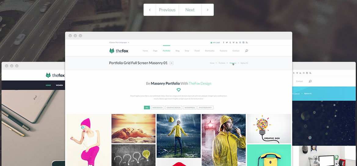
Images Carousel Options
Carousel Style - Select the carousel style ( design )
CSS Animation - Select an animation if needed.
Images - Upload your Images
Images size - Enter image size. Full for full width . Alternatively enter image size in pixels: 200x100 (Width x Height). Leave empty to use "thumbnail" size.
On Click - Select what to do when slide is clicked.
Hide prev/next buttons - Select if you want to hide the navigation.
Navigation style - Above or on image when hovered.
Image link - Use this field to make a link for the image
Hide Pagination control? - Select if you want to show or hide the pagination control
Top Margin - Add Top margin if needed, eg 20
Bottom Margin - Add Bottom margin if needed, eg 20
Blog
Display your Blog on the page
Check the following page for the different design:
Classic Layout
Multi Author Layout
Grid Layout
Masonry Layout
Timeline Layout
Blog Options
Post per page - Set the number of post you want to show on the page.
Blog Type - You can choose between 5 style: Standard, Grid, Masonry, Timeline, Multi Author. It will change the blog main design.
Thumbnail size - For Standard, Timeline, Multi Author you can choose between croped Thumbnail or Full size ( original size thumbnail ).
Number of Columns - For Grid and Masonry you can change the blog layout between 4, 3, 2 columns layout.
Category - You can filter the blog using category, select the category you want to show.
Color - Leave blank to use Color you set in theme options, but you can customize each color for the heading, text, highlight, hover, border, background.
Navigation Type - Select the navigation to use. Load More Button or Classic Navigation
Navigation Color - You can also customize the Navigation color if needed.
Recent Blog Posts
Display your Small Blog post on the page, check the Recent Blog Post page to see the design
Recent Blog Posts Options
Post to load - Set the number of post you want to show on the page.
Style - Select the blog style ( design )
Category - You can filter the blog using category, select the category you want to show.
Navigation Type - Select the navigation to use. Load More Button or No Navigation
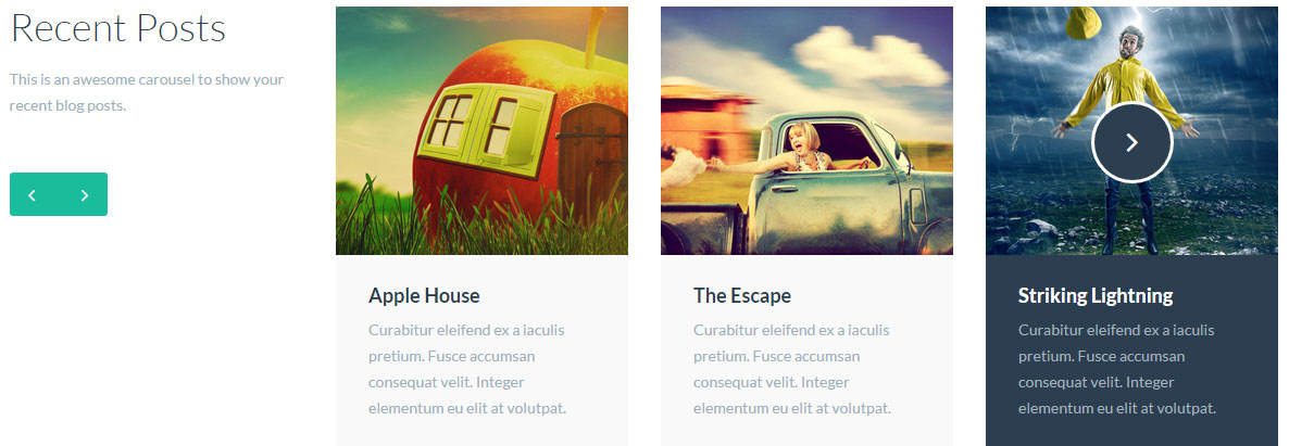
Blog posts Carousel
Display your Blog post in a carousel on the page, check the Carousel Blog page to see the design
Blog posts Carousel Options
Style - Select the blog style ( design )
Number of Post to load - Set the number of post you want to show on the page.
Number of post per line - Select the Number of post per line ( carousel layout )
Category - You can filter the blog using category, select the category you want to show.
Blog Slider
Display your Blog post in a Slider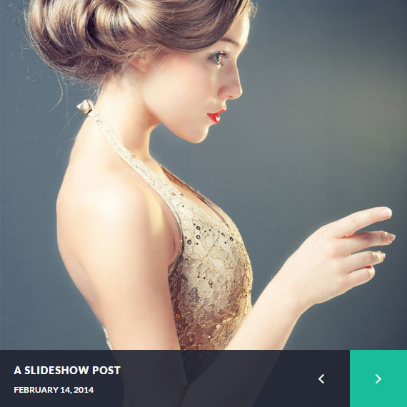 Check on the magazine page
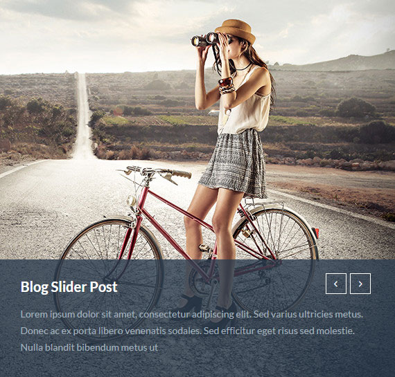 Check on the agency page
Blog Slider Options
Style - Select the blog style ( design )
Number of Post to load - Set the number of post you want to show on the page.
Category - You can filter the blog using category, select the category you want to show.
Portfolio
Create a Portfolio on your page
Check the following page for the different design:
Classic Layout
Packery Layout
Masonry Layout
With Title Layout
Full-width Layout
Portfolio Options
Portfolio Design Type - Here you can choose the portfolio type ( design ).
Choose Overlay Type - You can choose between 11 overlay style, we will add more!
Thumbnail Type - Choose what size you want to use for your thumbnail.
Portfolio Layout - You can choose the portfolio layout between 1 to 6 columns.
Category - You can filter the portfolio using category, select the category you want to show.
Tag - You can filter the portfolio using tag, select the tag you want to show.
Number of post to load - This is the number of post to show on the page
Use filter - If you want to use a filter for the portfolio check this box
Navigation Type - Choose if you want: No navigation, Load more button or Classic Navigation for your portfolio.
Portfolio posts carousel
Create a Portfolio Carousel on your page
Portfolio posts carousel Options
Style - Select the portfolio style ( design ).
Posts per line - Choose the number of Posts per line
Number of post to load - Choose the number of post to load.
Category - Filter the Carousel using portfolio Category.
Tag - Filter the Carousel using portfolio Tag.
Staff Members
Show your Staff / Team Member on your page
Check the following page too see the different design: Staff page
Staff Members Options
Number of Staff to Load - Select the Number of Staff to Load.
Group - You can filter the Staff using Group, select the Group you want to show.
Style - Select the Staff Style (design).
Number of Columns - Choose the Staff layout.
Navigation Type - Choose if you want: No navigation, Load more button or Classic Navigation for your Staff.
Use filter - If you want to use a filter for the Staff check this box
Staff Carousel
Show your Staff / Team Member in a carousel on your page
Check the following page too see the different design: Staff carousel page
Staff Carousel Options
Style - Select the Staff Style (design).
Group - You can filter the Staff using Group, select the Group you want to show.
Posts per Line - Choose the number of Staff to show per line ( layout ).
Number of Staff to Load - Select the Number of Staff to Load.
Sponsors / Partners

Show your Sponsor / Partners on your page 
Sponsors / Partners Options
Number of sponsor to Load - Select the Number of Sponsor to Load.
Number of column - Select the Number of Column (layout).
Group - Select the Group of sponsor to show.
Sponsors Carousel

Show your Sponsor / Partners in a Carousel on your page 
Sponsors / Partners Carousel Options
Number of sponsor to Load - Select the Number of Sponsor to Load.
Number of sponsor per line - Select the Number of Sponsor per line (layout).
Group - Select the Group of sponsor to show.
Contact Form 7
Show your Contact form on your page
For more info about contact for check Contact form Section
Contact Form 7 Options
CSS Animation - Select an animation if needed.
Font Weight - Select the font weight.
Field Position - Select the field position, horizontal or vertical.
Field Space - Choose the size of the space between fields.
Field Border Radius - If you want to make the field rounded ( e.g. 10 (optional) )
Textarea height - Select Textarea height e.g. 200 (optional)
Button type - Choose the form button design
Select contact form - Select the contact form to show.
Colors options - Customize the Color options if needed.
Pricing Table
Show your Pricing Table on your page
For more info about Pricing Table for check Pricing Table Section
To check the design check Pricing Table Page
Pricing Table Options
Pricing Table Style - Select the Pricing table style (design).
CSS Animation - Select an animation if needed.
Top Margin - Add Top margin if needed, eg 20
Bottom Margin - Add Bottom margin if needed, eg 20
Pricing Table - Select the Pricing Table to show.
Colors options - Customize the Color options if needed.
Table
Create a Table on your page
To check the design check Table Page
Table Options
Number of column - Select the Number of column for the table.
Colors options - Customize the Color options if needed.
Column Options
Table Column Title - Enter the title for the column.
Table values - Input Table values here. Divide values with linebreaks (Enter).
Colors options - Customize the Color options if needed.
Google maps
Show a Google Maps on your page
For more info about Google maps check Google Maps Section
Google Maps Options
Map Height - Select the map height, eg 400px
Latitude - Set your Latitude
Longitute - Set your Longitute
Zoom - Set the zoom for the map, Example : 20 ( for a close view ) , 5 ( for a far view )
Lists
Create a Lists on your page
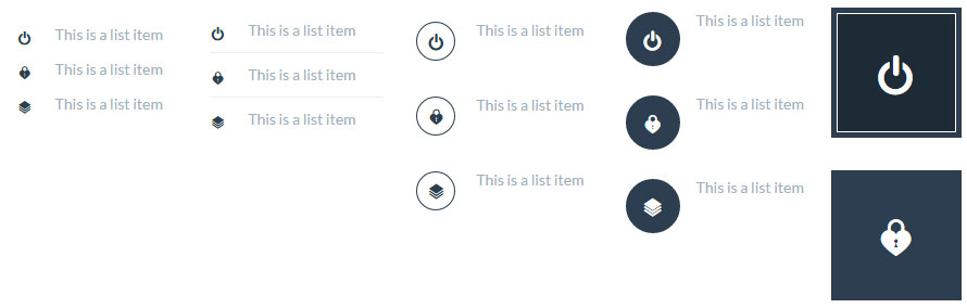
Lists Options
List style - Select the list style
Latitude - Set your Latitude
Longitute - Set your Longitute
Zoom - Set the zoom for the map, Example : 20 ( for a close view ) , 5 ( for a far view )
Lists Item Options
Icon - Select the icon for the list item
Icon Color - Select icon color
List title - Set list item title (optional)
Title color - Set title color
List main text - Set list item main text
Main text color - Set main text color
Link - Set a link for the list item (optional)
Testimonials
Create a Testimonials Carousel on your page
To check the design check Testimonials Page
Testimonials Options
Style - Select the Testimonials style (design).
CSS Animation - Select an animation if needed.
Top Margin - Add Top margin if needed, eg 20
Bottom Margin - Add Bottom margin if needed, eg 20
Colors options - Customize the Color options if needed.
Testimonial item Options
Author image - Select the Image for the testimonial.
Author Name - Put Author Name here.
Author Information - Put author information here ( company, job etc.. )
Quote from author - Main text for the testimonial.
4 Quotes
Create a block of 4 quotes on your page
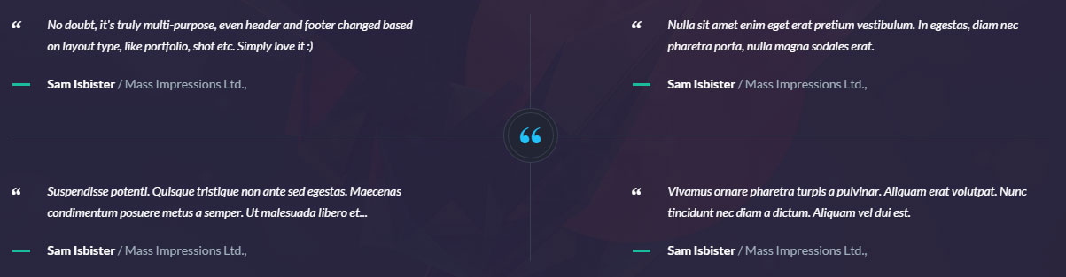
4 Quotes Options
CSS Animation - Select an animation if needed.
First Quote Author Name - Put First Author Name here.
First Quote Author Information - First Author Information.
First Quote Text - Text for the First Quote.
Second Quote Author Name - Put Second Author Name here.
Second Quote Author Information - Second Author Information.
Second Quote Text - Text for the Second Quote.
Third Quote Author Name - Put Third Author Name here.
Third Quote Author Information - Third Author Information.
Third Quote Text - Text for the Third Quote.
Fourth Quote Author Name - Put Fourth Author Name here.
Fourth Quote Author Information - Fourth Author Information.
Fourth Quote Text - Text for the Fourth Quote.
Colors options - Customize the Color options if needed.
Profile Testimonial

Create a Profile Testimonial Block on your page
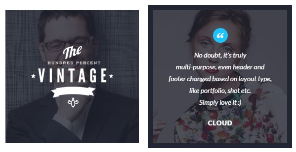
Profile Testimonial Options
CSS Animation - Select an animation if needed.
Background Image - Background image for the Block.
Logo Image - Logo for the testimonial.
Author Name - Author Name here.
Quote from author - Text for the Quote.
Colors options - Customize the Color options if needed.
IconBox
Create a Icon box on your page
To check the design check :
Icon boxes 01 Page
Icon boxes 02 Page
IconBox Options
IconBox Type - Select the Iconbox style (design).
CSS Animation - Select an animation if needed.
Top Margin - Add Top margin if needed, eg 20
Bottom Margin - Add Bottom margin if needed, eg 20
Icon - Select the icon for the box
Heading - Heading for the Iconbox
Main Text - Main text for the icon box (optional)
Button text - Enter text to generate a button ( optional )
Button link - Button for the link ( optional )
Change color on hover? - Check if you want the Iconbox to change color when hovered ( optional )
Colors options - Customize the Color options if needed.
Paragraph with icon
Create a Paragraph with Icon on your page
To check the design check :
Icon boxes 01 Page
Icon boxes 02 Page
IconBox Options
IconBox Type - Select the Iconbox style (design).
CSS Animation - Select an animation if needed.
Top Margin - Add Top margin if needed, eg 20
Bottom Margin - Add Bottom margin if needed, eg 20
Icon - Select the icon for the box
Heading - Heading for the Iconbox
Main Text - Main text for the icon box (optional)
Button text - Enter text to generate a button ( optional )
Button link - Link for the button ( optional )
Change color on hover? - Check if you want the Iconbox to change color when hovered ( optional )
Colors options - Customize the Color options if needed.
Button
Create a Button on your page
To check the design check Buttons Page
Button Options
Button Type - Select the Button style (design).
CSS Animation - Select an animation if needed.
Button size - Select the button size.
Icon - Select the icon for the button (optional)
Border Radius - If you want to add radius to your button ( rounded corner ) set number, eg : 10
Button Text - Text for the Button
Font weight - Select the font weight for the button
Button link - Link for the button ( optional )
Button position - Left - Center - Right
Top Margin - Add Top margin if needed, eg 20
Bottom Margin - Add Bottom margin if needed, eg 20
Left Margin - Add Left margin if needed, eg 20
Right Margin - Add Right margin if needed, eg 20
Colors options - Customize the Color options if needed.
Double Button
Create a Two button next to each other on your page
To check the design check Promo box ( bottom of the page )
Double Button Options
Button style - Select the Button style (design).
First button text - Put the first button text.
First button link - Put the first button link.
First button CSS Animation - Select an animation for the first button if needed.
Second button text - Put the second button text.
Second button link - Put the second button link.
Second button CSS Animation - Select an animation for the second button if needed.
Top Margin - Add Top margin if needed, eg 20
Bottom Margin - Add Bottom margin if needed, eg 20
Left Margin - Add Left margin if needed, eg 20
Right Margin - Add Right margin if needed, eg 20
Colors options - Customize the Color options if needed.
Timeline Event
Create a Timeline with Event on your page
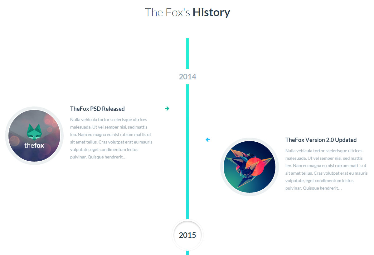 To check the design check About us 04 ( bottom of the page )
Timeline Event Options
Top Margin - Add Top margin if needed, eg 20
Bottom Margin - Add Bottom margin if needed, eg 20
Colors options - Customize the Color options if needed.
Event Options
Image - Select the Button style (design).
Event Title - Put the first button text.
Event Main Text - Put the first button link.
CSS Animation - Select an animation for the module if needed.
Date Options
Date - Enter the Date 2014, FEB etc..
Tabs
Create Tabs on your page
To check the design check Tabs Page
Tabs Options
Auto rotate tabs - Select if you want the tabs to rotate automatically.
Tabs style - Select the Tabs style ( design ).
Tabs color - Select the Tabs color
Top Margin - Add Top margin if needed, eg 20
Bottom Margin - Add Bottom margin if needed, eg 20
Tour
Create Vertical Tabs / Tour on your page
To check the design check Tabs Page
Tabs Options
Auto rotate tabs - Select if you want the tabs to rotate automatically.
Tabs style - Select the Tabs style ( design ).
Tabs positions - Select the Tabs position, left or right
Top Margin - Add Top margin if needed, eg 20
Bottom Margin - Add Bottom margin if needed, eg 20
Accordion
Create Accordion on your page
To check the design check Accordion Page
Accordion Options
Active section - Enter section number to be active on load or enter false to collapse all sections.
Allow collapsible all - Select checkbox to allow all sections to be collapsible.
Disable keyboard interactions -Disables keyboard arrows interactions LEFT/UP/RIGHT/DOWN/SPACES keys.
Tabs style - Select the tabs style ( design ).
Top Margin - Add Top margin if needed, eg 20
Bottom Margin - Add Bottom margin if needed, eg 20
Section Options
Section Title - Enter the title for the section.
Colors options - Customize the Color options if needed.
Promo box
Create a Promotion Box on your page
To check the design check Promo Box Page
Promo box Options
Style - Select the Promo box style ( design ).
CSS Animation - Select an animation for the module if needed.
Box Title - Enter The Title for the Box.
Box Main Text - Main text for the box.
Button Text - Text for the box button
Button link - Link for the box button
Icon - Select Icon for the box
Icon size - Select the icon size, eg 20
Top Margin - Add Top margin if needed, eg 20
Bottom Margin - Add Bottom margin if needed, eg 20
Alert Message
Create an Alert Message / Box on your page
To check the design check Alert Message Page
Alert Message Options
Alert Style - Select the Alert style ( design ).
Alert Type - Select the Alert type.
CSS Animation - Select an animation for the module if needed.
Alert Title - Enter The Title for the Alert.
Alert Text - Main text for the Alert.
Top Margin - Add Top margin if needed, eg 20
Bottom Margin - Add Bottom margin if needed, eg 20
Progress Bar
Create an Progress Bar on your page
To check the design check Progress Bars Page
Progress Bar Options
Style - Select the Progress Bar style ( design ).
Bar Options
Progress bar title - Select the Progress Bar title ( design ).
Percentage - Enter the percentage eg: 70
Add Stripe? - Select if you want to add stripe to the bar
Animate the stripe? - Select if you want to make the stripe move
Top Margin - Add Top margin if needed, eg 20
Bottom Margin - Add Bottom margin if needed, eg 20
Colors options - Customize the Color options if needed.
Pie Chart
Create an Pie chart on your page
To check the design check Progress Bars Page
Pie Chart Options
Style - Select the Pie Chart style ( design ).
CSS Animation - Select an animation for the module if needed.
Percentage - Enter the percentage eg: 70
Pie Chart Heading - Enter The Heading for the pie chart.
Pie Chart Text - Enter text for the Pie Chart.
Colors options - Customize the Color options if needed.
Count to
Create an Number Count To on your page
Count To Options
Count to type - Select the Count to type ( design ).
CSS Animation - Select an animation for the module if needed.
Number - Enter the number to count to
Number of decimal - Set the number of decimal of your number eg ( if number is 2.300 the number of decimal is 3 )
Speed - The Speed of the count to animation
Heading - Heading for the count to
Colors options - Customize the Color options if needed.
Social Icons
Display your Social Icons on your page
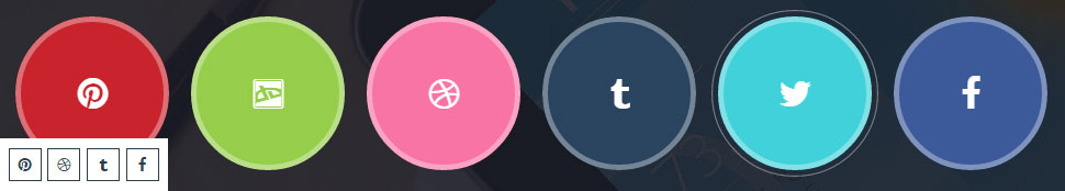
Social Icons Options
Social Icons Style - Select the Social Icons style ( design ).
CSS Animation - Select an animation for the module if needed.
Top Margin - Add Top margin if needed, eg 20
Bottom Margin - Add Bottom margin if needed, eg 20
Social Link - Put a link for the social icon you want to show
Colors options - Customize the Color options if needed.
Share Icons
Display Share Icons on your page
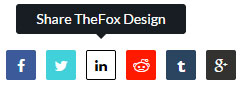
Share Icons Options
CSS Animation - Select an animation for the module if needed.
Icons Position - Select the Icons position left - center - right.
URL - Enter the url you want to share
Message to share - Enter the Message to Share
Icon hover message - Enter the Icon hover message
Social Icons - Select the social icons to use to share
Colors options - Customize the Color options if needed.
Twitter Carousel
Display a Twitter Carousel on your page
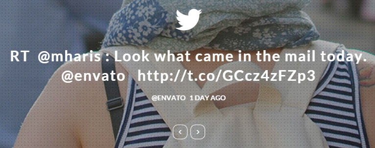
Twitter Carousel Options
Carousel Style - Select the Style for twitter carousel ( design )
CSS Animation - Select an animation for the module if needed.
Twitter id - Enter the twitter id for the carousel
Number of Tweet to load - Enter the number of tweet to load
Colors options - Customize the Color options if needed.
Search Field
Display a Search Field on your page

Search Field Options
CSS Animation - Select an animation for the module if needed.
Place Holder - Enter the Place holder for the search field
Border Radius - If you want to make the border rounded enter a number eg: 5
Top Margin - Add Top margin if needed, eg 20
Bottom Margin - Add Bottom margin if needed, eg 20
Colors options - Customize the Color options if needed.
Code Box
Display a Code Box on your page
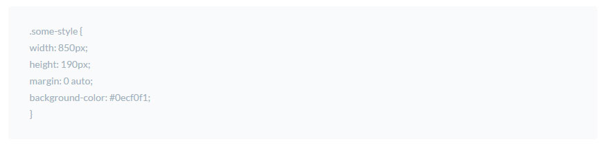
Code Box Options
CSS Animation - Select an animation for the module if needed.
Text - Text for the code box.
Top Margin - Add Top margin if needed, eg 20
Bottom Margin - Add Bottom margin if needed, eg 20
Woocommerce product
Display a WooCommerce Product Carousel on your page
Woocomerce Product Options
Posts per line - Select the number of posts per line.
Number of Products to load - Select the number of product to load for the woocommerce.
Product type - Select the Product Type ( recent product / featured product )
4k Icon
Display an single Icon on your page
Icon Options
Icon - Choose the icon you want to use
Icon size - Select the icon size
Background shape - Select the background shape for the icon (optional)
Link to go to When Icon is Clicked - Enter a URL here to make your icon a link.
Icon Float - Select the icon postion Center ( don't float ) - left - right
Icon Margin - Select the icon margin
Class name - You can add an extra class name to this icon if you want to add custom CSS styles to it.
Use Page Builder
Activate Page builder
We will explain how to active the Visual Composer.
Add and modify Row Layout
We will explain how to add Row and change Row layout works.
Edit Element
We will explain how to edit element.
Duplicate Element
We will explain how to duplicate element.
Remove Element
We will explain how to remove element.
About Row / Column / Custom heading / Text Block Design options
We will explain how to edit design options to make your page looks beautiful.
Official Plugin Documentation
For More information about the Visual Composer check the official documentation.
Activate Page builder
Step 1 - Log in to your WordPress Administration Panel.
Step 2 - Click on Pages > Add New.
Step 3 - Click on Backend Editor.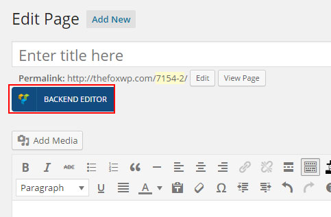
Add and modify Row Layout
Step 1 - Go to your page / post, first activate the backend editor and click Add Element
Step 2 - Select the Row Module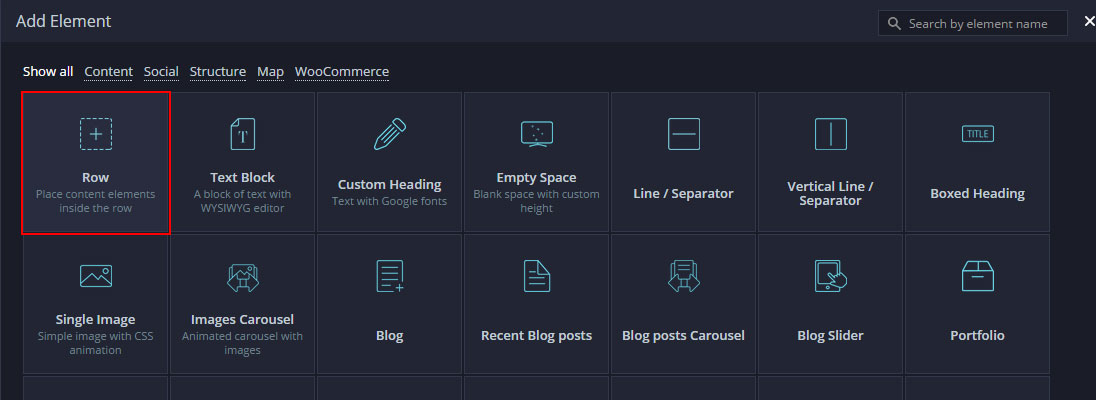
Step 3 - Click on the Edit This Row (pencil icon) to Edit the Row element ( in our example we use row with 3 columns filled with text block )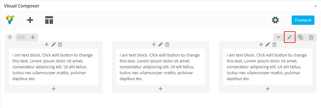
Step 4 - To change the Row layout ( number of columns ) you need to click the second Icon from the left then select a layout or custom to make your own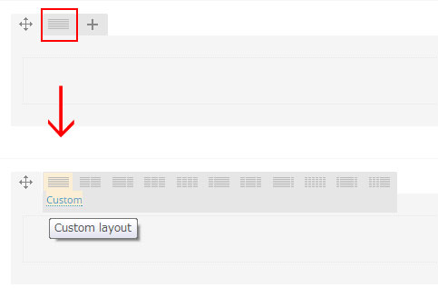
Edit Element
Pencil Icon - To Edit Row, Column or Module you need to click the Pencil icon.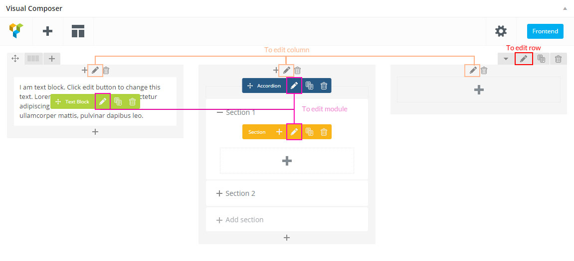
Duplicate Element
Pages Icon - To Duplicate Row or Module you need to click the Pages icon.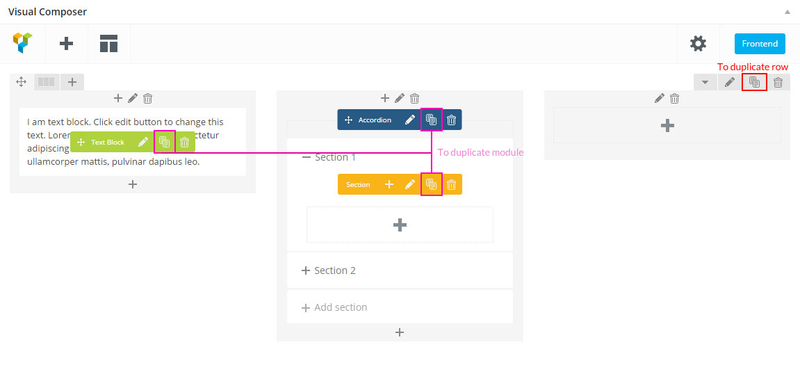
Remove Element
Trash Box Icon - To Remove Row, Column or Module you need to click the Trash Box icon.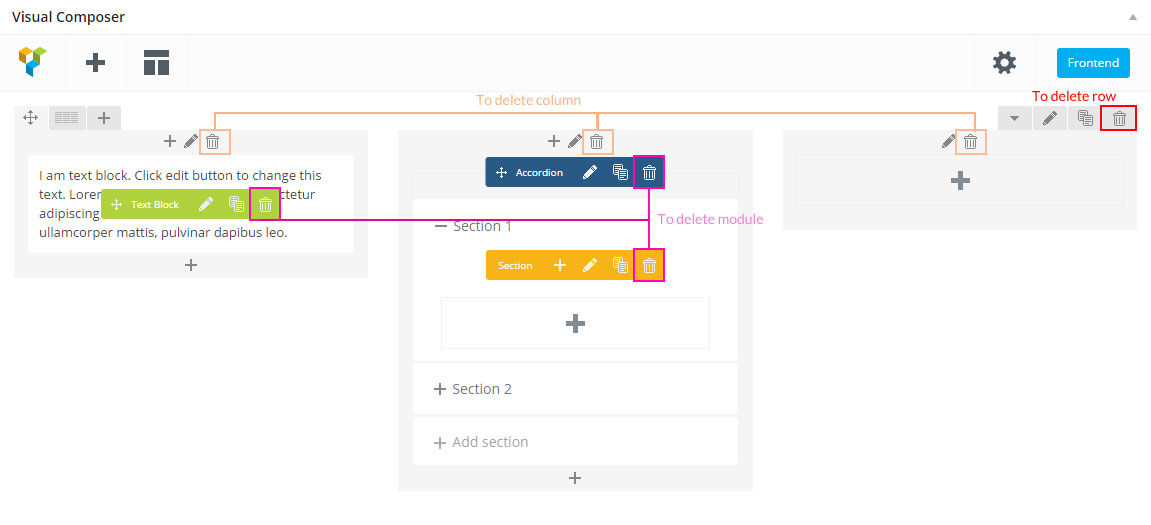
About Row / Column / Custom heading / Text Block Design options
Design Options - When you edit row / column / custom heading / text block module, you can edit the design options .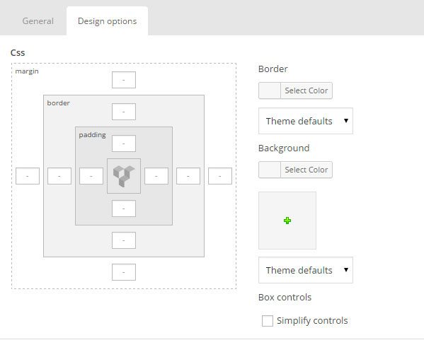 Row / Custom Heading / Text Block element have a default Bottom Margin of 35 pixel, you may want to set it to 0 if you don't want to have bottom space
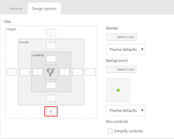 It is Good to add bottom Padding to your Column, so they will looks good on mobile
 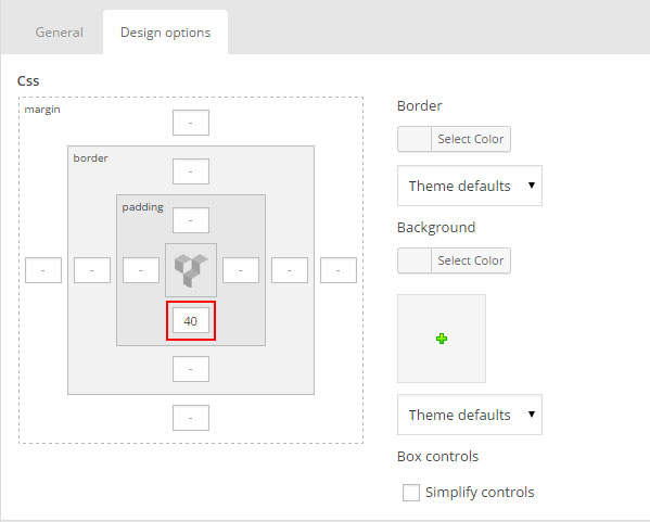 Left and Right Margin should NEVER be modified, please left blank
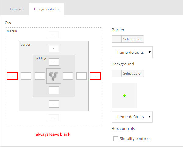 For Row module the Left and Right Padding should also NEVER be modified, please left blank
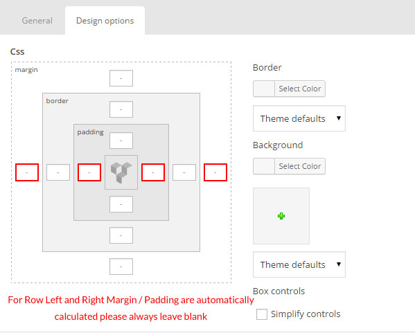
Page Title
Set the Global Settings for the Page Title
This is the title settings that will apply for each page, we can say that this will be the default title style.
Set the Individual Page Title Settings
This is the title settings that will apply for each page, we can say that this will be the default title style.
Set the Global Settings for the Page Title
Step 1 - Log in to your WordPress Administration Panel, Click on TheFox > Title Styling.
Step 2 - Set the Title Background Color
Step 3 - Set the Title Text Color.
Step 4 - Set the Title border color.
Step 5 - Set theBreadcrumbs Color.
Step 6 - Set theBreadcrumbs button background Color.
Step 7 - Set theBreadcrumbs button text and border Color.
Step 8 - Select if you want to show or hide Breadcrumbs.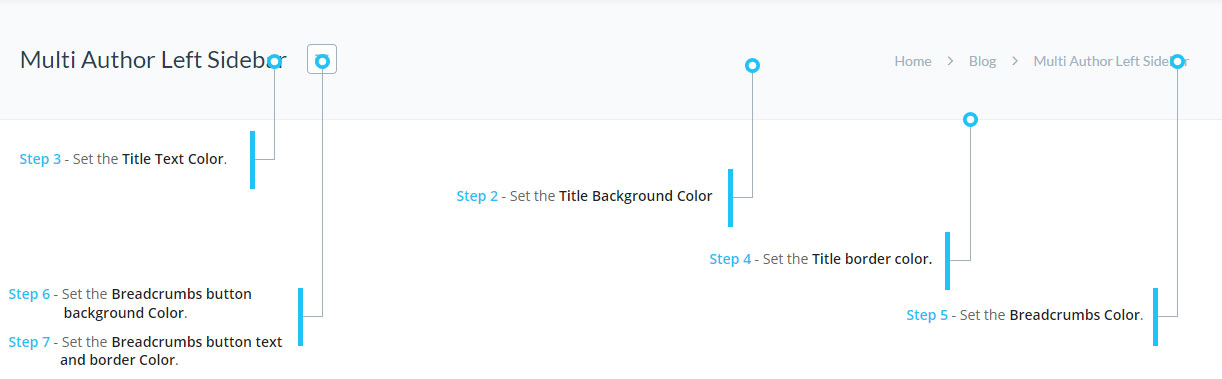
Set the Individual Page Title Settings
Step 1 - Go editing the page / post you want to customize the title style.
Step 2 - Scroll down until you see the page options panel.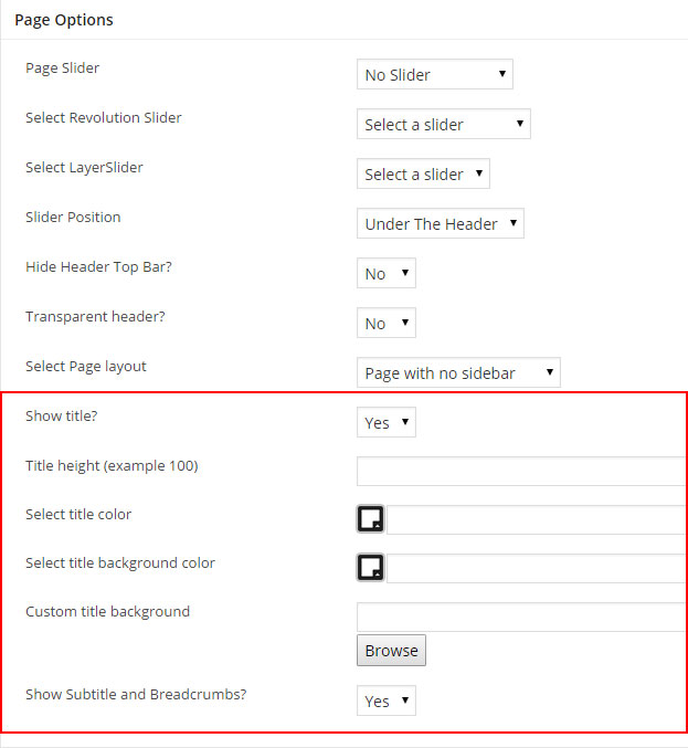
Show Title - Select to show or hide the title ( good to hide the title when using revolution slider )
Title Height - You can change the title height if needed, great when you are using a image background
Select title color - Select the title text color ( will also effect the breadcrumbs color ).
Select title background color - Select the title background color.
Custom title background - You can upload an image to use as the title background.
Show Subtitle and Breadcrumbs? - Select if you want to show the subtitle and breadcrumbs.
Create page with Transparent Header
Follow the next step to learn how to create a page with a Transparent Header.
Transparent Header
Step 1 - Go create or edit a page : Page > Add new.
Step 2 - Scroll down until you see the page options panel.
Step 3 - Change "Transparent Header" to Yes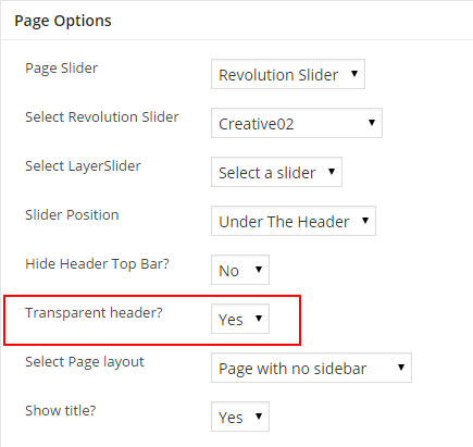
Step 4 - Update, publish your page.
Create page with Revolution / Layer slider
Follow the next step to learn how to create a page with a revolution / layer slider. First make sure you have already created a revolution or layer slider
Page with Revolution / Layer slider
Step 1 - Go create or edit a page : Page > Add new.
Step 2 - Scroll down until you see the page options panel.
Step 3 - Change "Show title" to No ( optional )
Step 4 - Change "Page Slider" to Revolution / Layer Slider.
Step 5 - Then Select the Revolution / Layer slider from the "Select revolution / layer slider" field.
Step 6 - Select the "Slider Position" you can choose between Under the header or Above the header.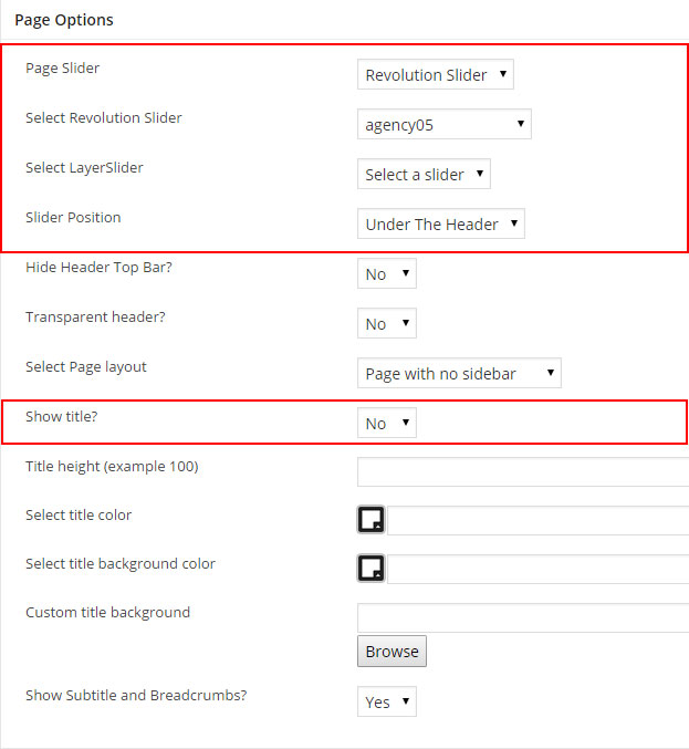
Step 7 - Update, publish your page.
Create Full width Section
Full width Section ( background only )
We will explain how to create a full width background section
Full width Section ( content )
We will explain how to create a full width content section.
Full width Section ( background only )
Step 1 - Go to your page / post, first activate the backend editor and click Add Element
Step 2 - Select the Row Module
Step 3 - Click on the Edit This Row (pencil icon) ( in our example we use row with 3 columns filled with text block )
Step 4 - Change the Type setting to Full width Background and change text color if needed 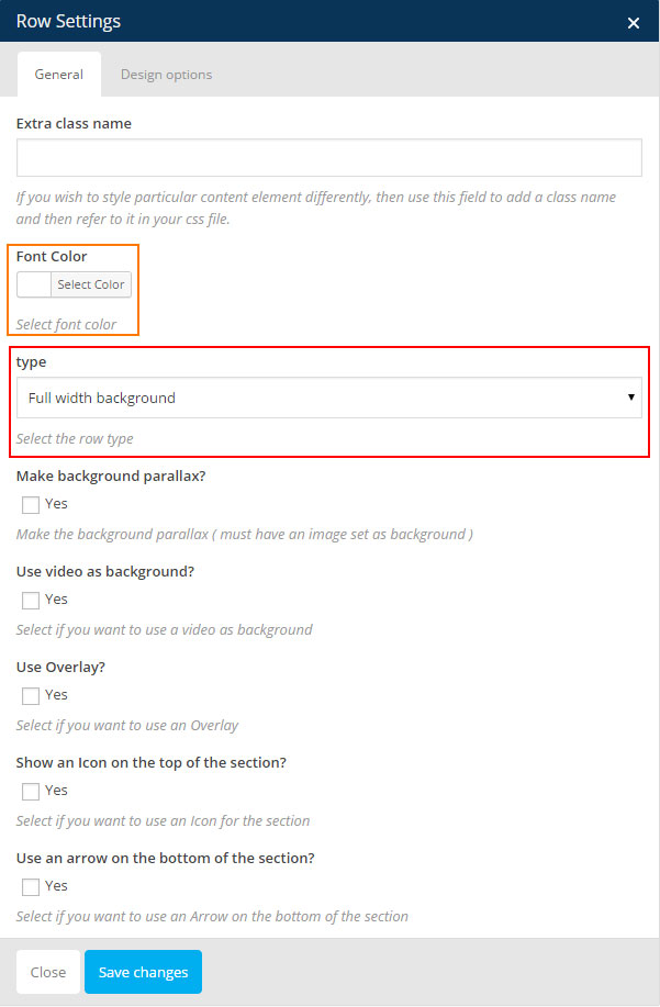
Step 5 - Click on Design Options ADD padding and REMOVE margin for better result, change the Background color or Background image if needed then click Saves changes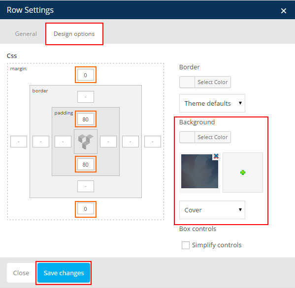
Step 6 - Your page should now have a background that reach the edge of your page 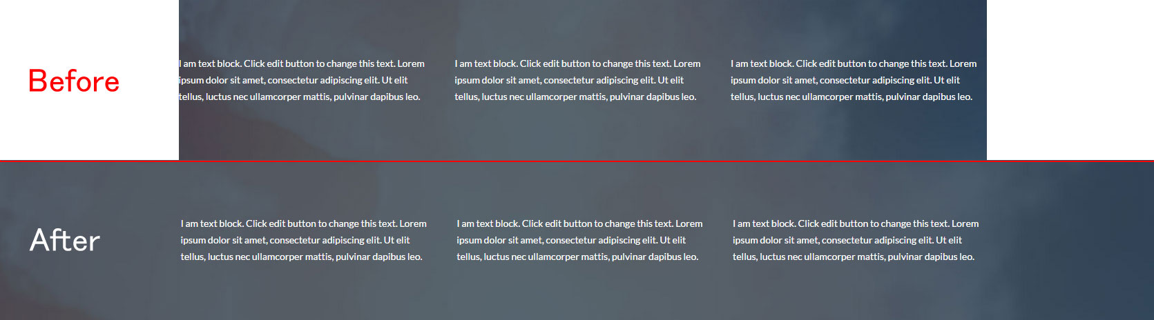
Full width Section ( content )
Step 1 - Go to your page / post, first activate the backend editor and click Add Element
Step 2 - Select the Row Module
Notice - in our example we use row with 3 columns filled with text block to show you how the full width content works. Before any modification the page looks like this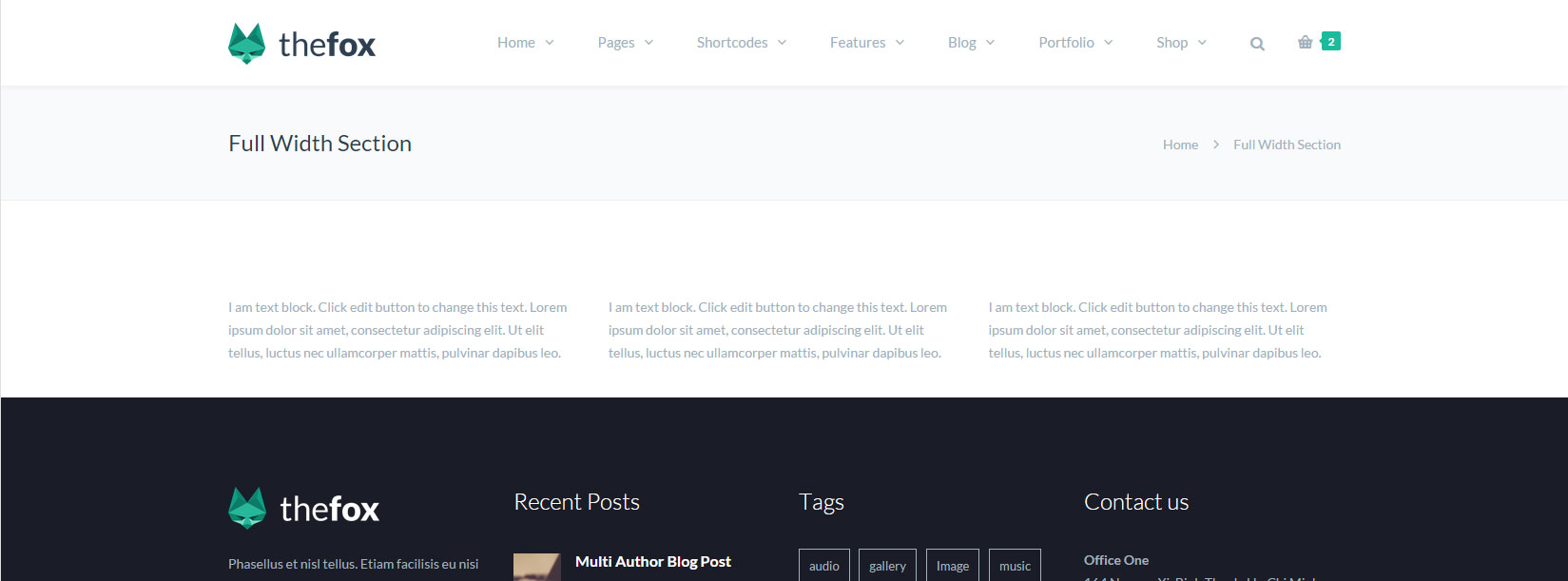
Step 3 - Click on the Edit This Row (pencil icon)
Step 4 - Change the Type setting to Full width content then click Save changes 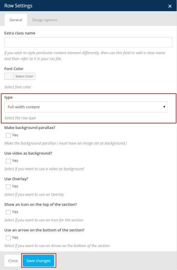
Notice - The Page has now Full widht content but our Columns looks bad we need to Edit and Add some space to the columns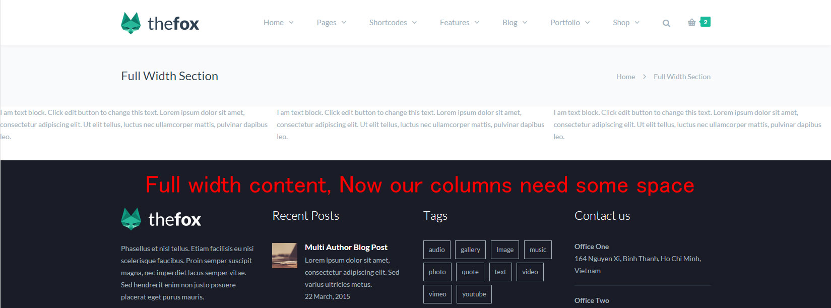
Step 5 - Click on Edit This Column (pencil icon) 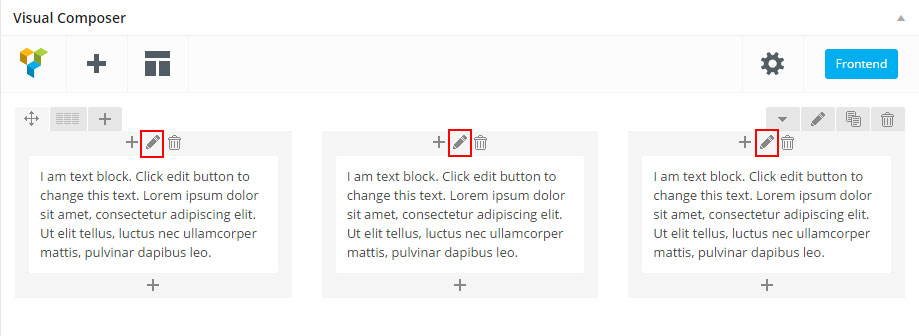
Step 6 - The Column Settings should appear, click on Design Options then add Padding to your column ( using percentage is better for Responsive ) then click Save Changes and do the same for the other columns 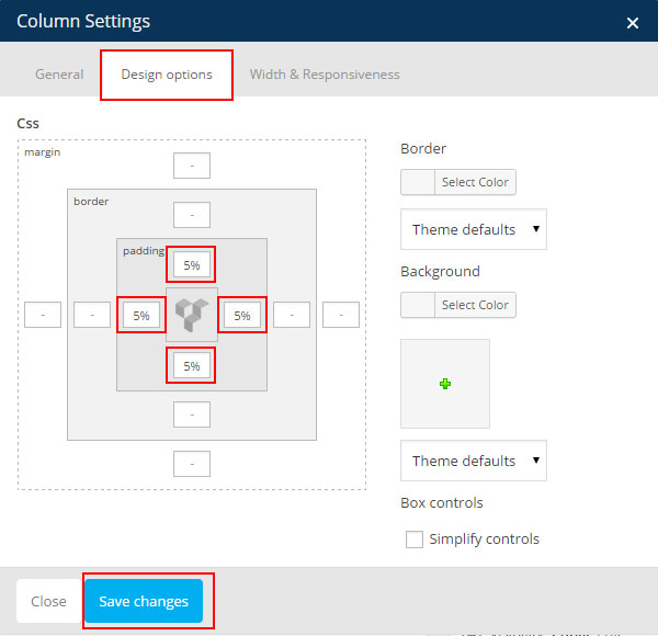
Notice - Now the Column looks better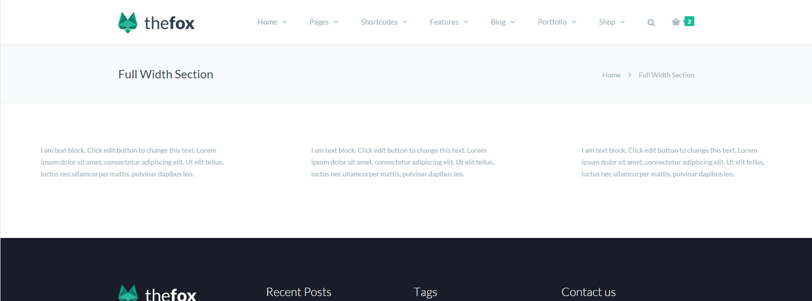
Step 7 - Now let's try to change the column background and text color, click on Edit This Column Change the Font Color and Add Animation if needed, then click Design Options and change Background Color then click Saves Changes 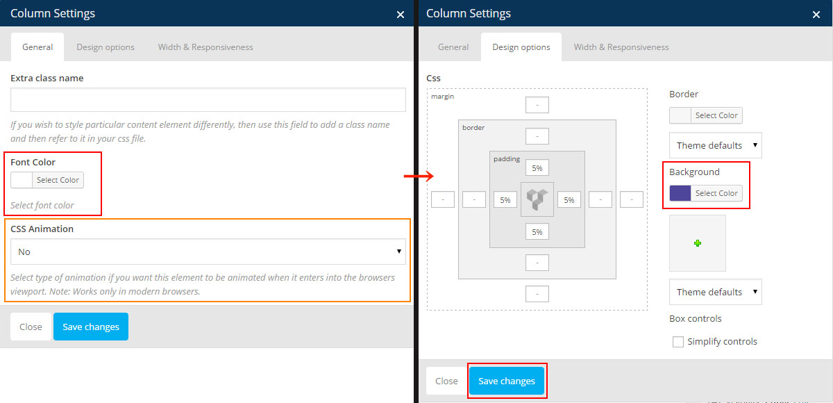 Do the same for the other columns to have this result
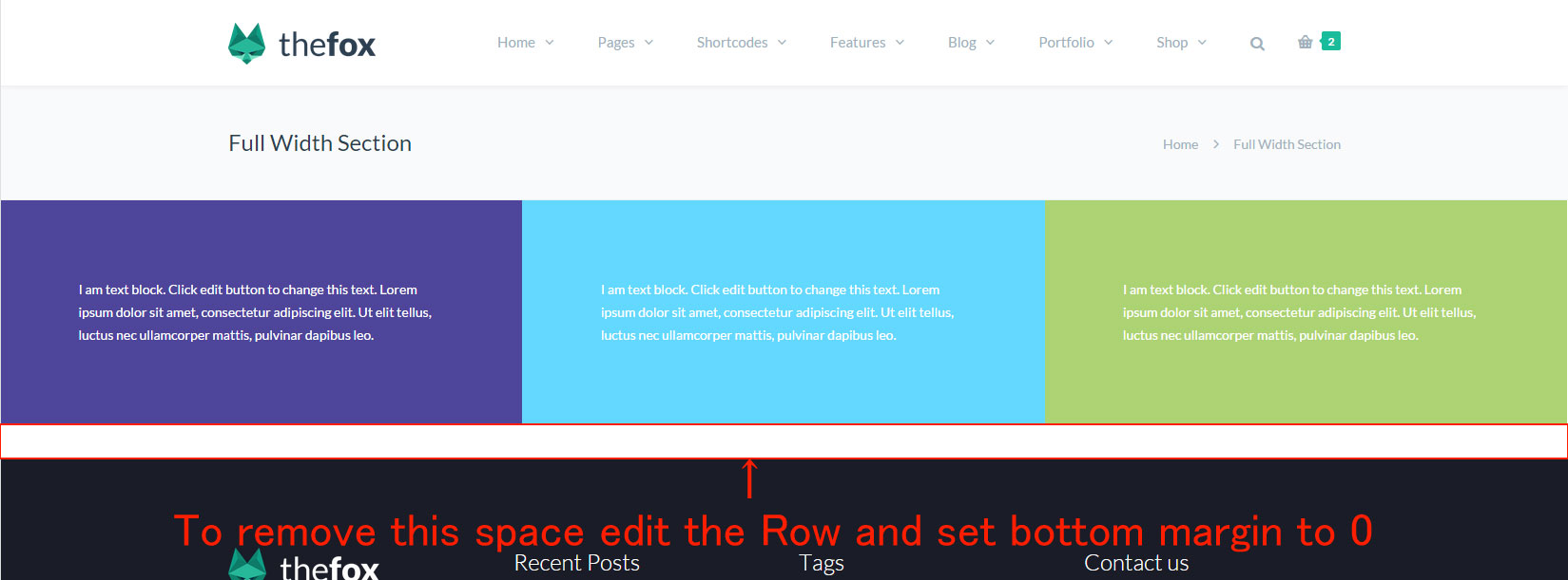
Create Parallax / Video Section
Parallax Section
We will explain how to create a Parallax Section
Video Section
We will explain how to create a Video section.
How to Upload and Get Video URL / Link
We will explain how to upload Video and get the Video URL / Link.
Parallax Section
Step 1 - Go to your page / post, first activate the backend editor and click Add Element
Step 2 - Select the Row Module
Step 3 - Click on the Edit This Row (pencil icon)
Step 4 - Change the Type setting to Full width Background or Full width Content and check Make Background parallax then choose the Parallax type 
Step 5 - Click on Design Options ADD padding and REMOVE margin for better result, add a Background Image change to Cover and then Saves changes
Step 6 - Update or Publish your page and you should now have a section with parallax background
Video Section
Step 1 - Go to your page / post, first activate the backend editor and click Add Element
Step 2 - Select the Row Module
Step 3 - Click on the Edit This Row (pencil icon)
Step 4 - Change the Type setting to Full width Background or Full width Content then check Use video as background? and paste your Video Link
Notice - If you don't know how to upload video and get the video link please check the How to Upload and Get Video URL / Link
Step 5 - You can edit the Design options ( remove margin and add padding "optional" ) and then Saves Changes and Update / Publish your page. You should now have a Full width Section with Video
How to Upload and Get Video URL / Link
Step 1 - Log in your WordPress Admin Panel then Click on Media > Add New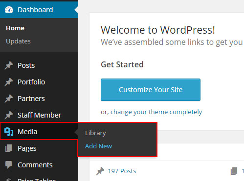
Step 2 - Drop or Select the video file you want to upload 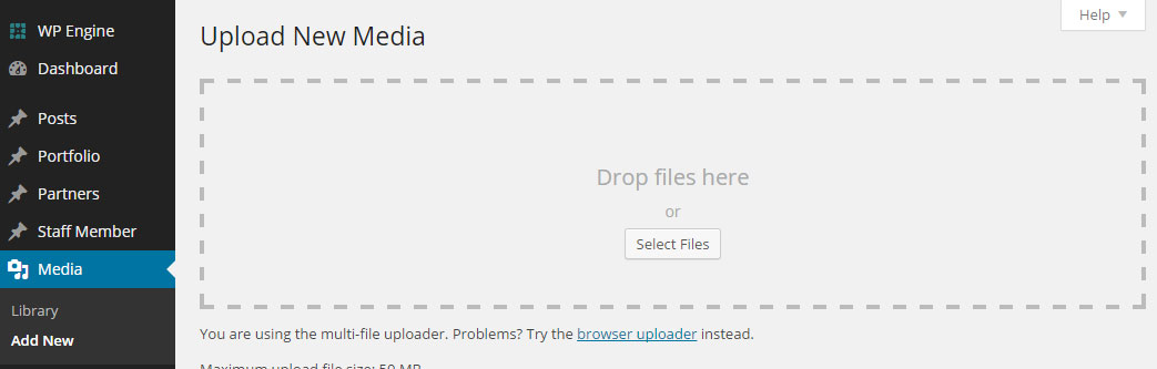
Step 3 - Click the Edit button, a new tab with your video information should open 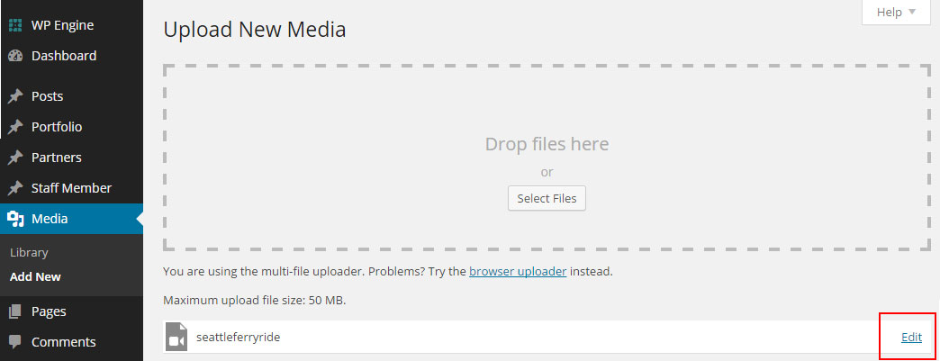
Step 4 - On the Top Right of the Page you should be able to see the File Url, that what you need to copy and paste in the Video link field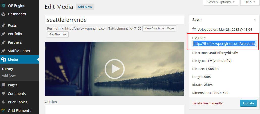
Notice - I will now explain how to get video URL of video that are already uploaded
Step 1 - Log in your WordPress Admin Panel then Click on Media
Step 2 - Change the Dropdown that is on the Top Left of the page from All to Video then click on Filter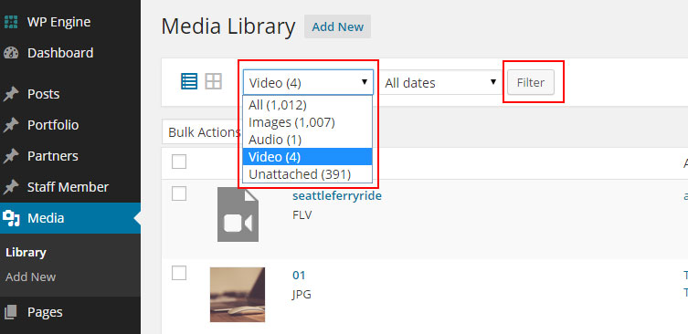
Step 3 - Click on the Video you want to get the URL
Step 4 - On the Top Right of the Page you should be able to see the File Url, that what you need to copy and paste in the Video link field
How to Create One Page
Set the One page sections ID
First we will explain how to create the page
Set the menu for the One page
We will explain how to set the menu needed for your one page.
Set the One page sections ID
Step 1 - Go create or edit a page : Page > Add new.
Step 2 - Select the Row Module
Step 3 - Click on the Edit This Row (pencil icon)
Step 4 - Set an ID for the row, You need to use the Same ID when you create the Menu 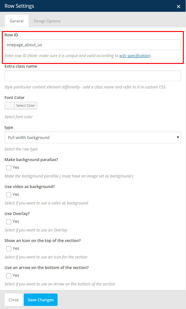
Step 5 - Repeat the step 3 and 4 for all the row you want to link for the Menu
Step 6 - Change the page template to One Page 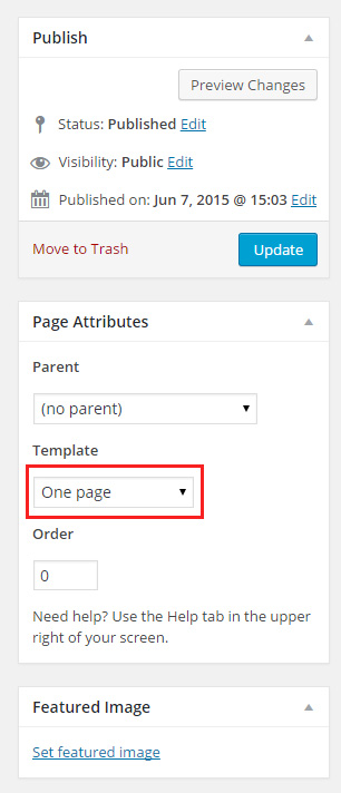
Step 7 - Update or Publish your page then go create the Menu needed for your page to work
Set the menu for the One page
Step 1 - Login to the WordPress Dasrdoard.
Step 2 - From the 'Appearance' menu on the left-hand side of the Dasrdoard, select the 'Menus' option to bring up the Menu Editor.
Step 3 - Select Create a new menu at the top of the page.
Step 4 - Enter a name for your new menu in the Menu Name box.
Step 5 - Click the Create Menu button.
Step 6 - Click on Custom Links and add the div ID you used in you page ROW ( example if you set row id to : the_portfolio you need to set the custom link to #the_portfolio ).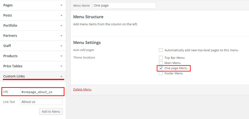
Step 7 - Repeat and add custom link for each section you want to link, then set the menu as One Page menu.
Set your Homepage
Step 1 - Go to Settings > Reading in your WordPress Dasrdoard panel.
Step 2 - Set "Front page displays" to a "Static Page".
Step 3 - In the drop down menu for "Front Page" choose a page which will be your home page.
Step 4 - Leave the drop down menu for "Posts page" empty, as this is not used by the theme.
Step 5 - Save changes.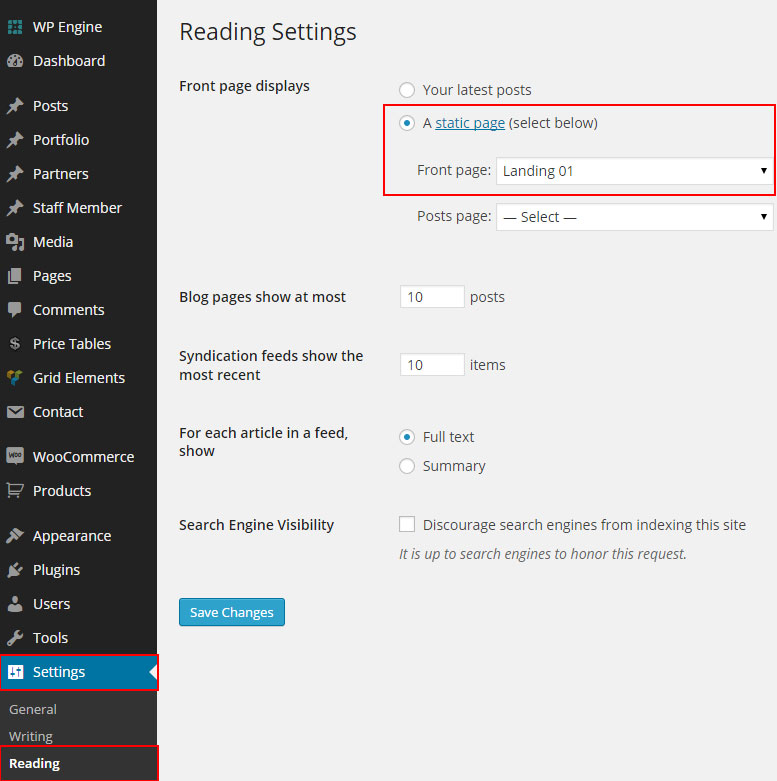
Set Up Sidebars
TheFox allow you to generate unlimited number of sidebars. You can set each page with a different sidebar of your choice. Follow the next step to learn how to set up your sidebar
Generate Sidebars
We will explain how to create a custom Sidebars
Fill Sidebars with Widgets
How to fill your sidebar with widgets
Individual Page/Post Sidebar Settings
How to Set custom sidebar for your Page / Post
Generate Sidebars
Step 1 - Navigate to Appearance > Sidebars.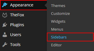
Step 2 - Click the + Add New Sidebar button.
Step 3 - Provide a unique name for the newly created sidebar and hit OK.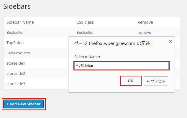
Fill Sidebars with Widgets
Step 1 - Go to Appearance > Widgets. 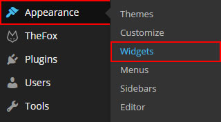
Step 2 - You should see all Generated Sidebars there.
Step 3 - Drag Widgets onto the desired Sidebar Areas and customize each widget.
Individual Page/Post Sidebar Settings
Step 1 - Open the post / page in the Admin Panel for editing.
Step 2 - Scroll until you see the Page/Post options panel and search for Page layout.
Step 3 - Change the Page Layout to Page with Right Sidebar or Left Sidebar.
Step 4 - Scroll until you see the Sidebar panel, you will be offered an option to choose one of the generated sidebar.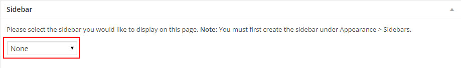
Step 5 - Update / Publish your Page / Post .
WooCommerce
TheFox themes is 100% compatible with the WooCommerce plugin for WordPress. It includes full design integration of the WooCommerce pages, shortcodes and widgets.
If you want to use Woocommerce you will have to install the plugin, to do so go to Plugins > Add New , search for Woocommerce.
The Plugin you need to install is WooCommerce - excelling eCommerce by WooThemes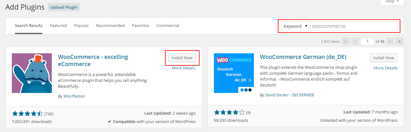
For full documentation visit the following websites:
- WooCommerce Plugin Page
- WooCommerce Documentation
- WooCommerce Community Forums
- WooCommerce Builtin Shortcodes
Change Shop Page Options
We will explain how to change the Shop page layout and the number of product to show
Change Shop Page Options
Step 1 - Log in to your WordPress Administration Panel, Click on TheFox > WooCommerce options.
Step 2 - Select the Page Layout ( number of columns ) and the number of Item per page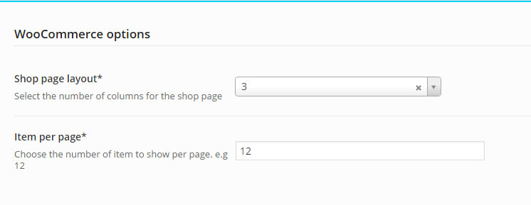
Step 3 - To add sidebar to shop page go edit your shop page then scroll down to page options and change layout to Left / Right sidebar
Create Google Maps
Full width Google Map
We will explain how to create a full width Google map section
Embed Google Map Block
We will explain how to create a embed google maps block
Full width Google Map
Step 1 - Go to your page / post, first activate the backend editor and click Add Element
Step 2 - Select the Google Maps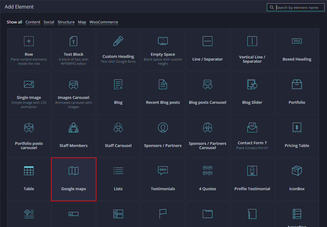
Step 3 - The Google Maps settings should open, you need to modify the Latitude and Longitude, you can also modify the height and zoom options 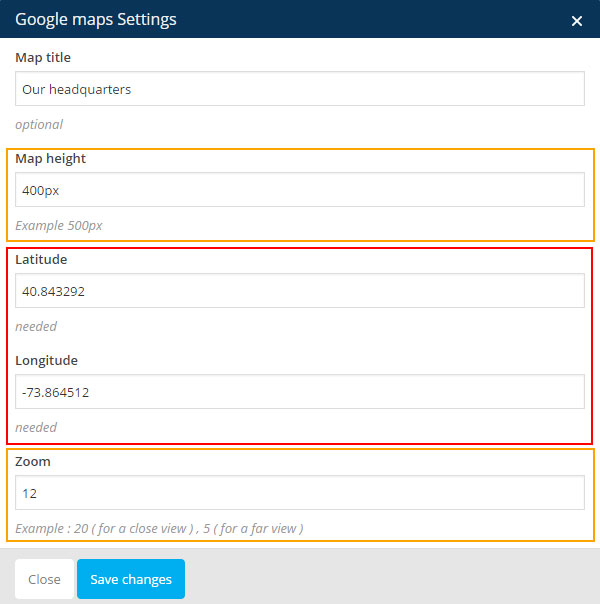
Step 4 - To get the Latitude and Longitude go to Google Maps site, make a right click on the place you want to show for your map and click What's here 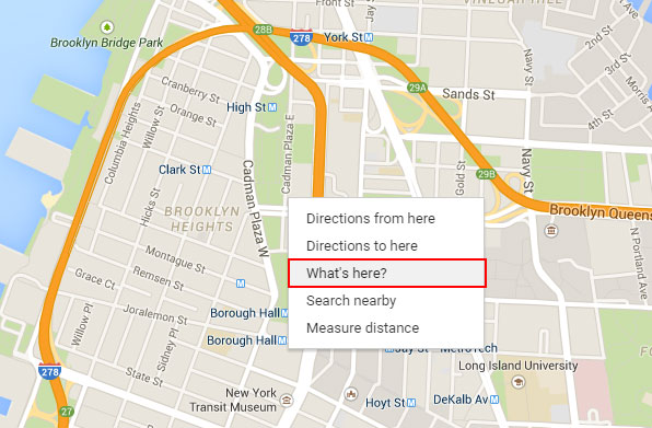 Then on the top left you should have the name of the place and can copy the Latitude and Longitude
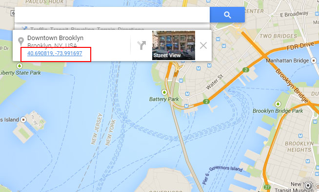 In this example Latitude is : 40.690819 and Longitude is : -73.991697.
Step 5 - Update the Latitude and Longitude and click Save changes.
Step 6 - Edit the Row that contains your Google Maps module and make it full width content ( optional ).
Embed Google Map Block
Step 1 - Go to your page / post, first activate the backend editor and click Add Element
Step 2 - Select the Google Maps ( map block )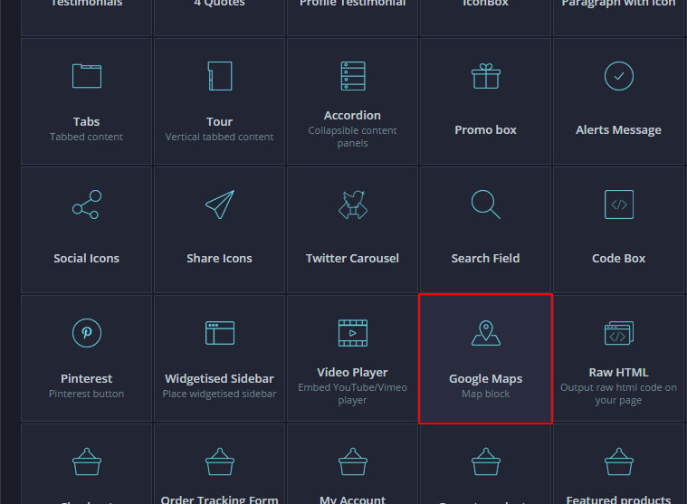
Step 3 - Visit Google Maps site to create your map. 1) Find location 2) Click "Cog Icon" on bottom right then click "Share or embed map"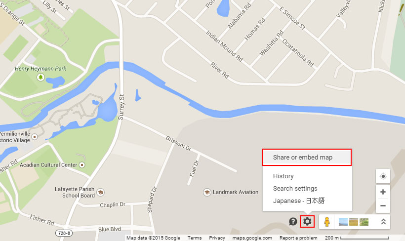
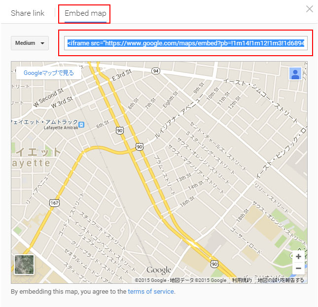
Step 6 - Copy iframe code and paste it, set height if needed then save changes.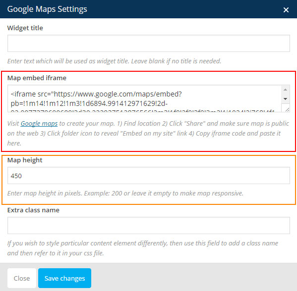
How To
Set Up Twitter widget
The Custom twitter widget requires authenticate, I made an other documentation file which explain how to do it. Check the Twitter widget documentation
Set Up Page Loader
Follow the next step to learn how to set the Page Loader.
Page Loader
Step 1 - Log in your WordPress Admin click TheFox > Page Loader.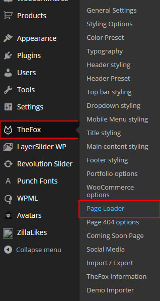
Step 2 - Set Use Page Pre-Loader to Yes then Select the main Color Light or Dark
Step 3 - Select the Loader Type, Simple (small) or Complex (with logo)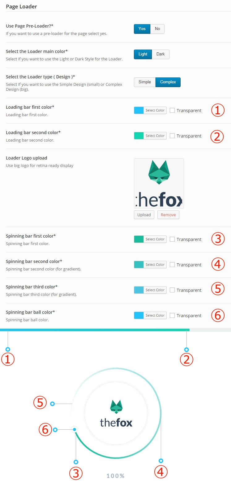
Step 4 - Saves Changes
Change Font / Typography
Change Website Main Font / Typography
We will explain how to change the Website main font.
Change Header Menu Font / Typography
We will explain how to change the Website Header / Menu font.
Change Headings Font / Typography
We will explain how to change the Website Headings font.
Change Website Main Font / Typography
Step 1 - Log in your WordPress Admin click TheFox > Typography.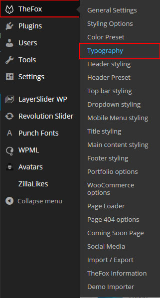
Step 2 - If you want to change the Main Font change Use Custom font for body to On. Then choose the font the font weight, font size and line-height. The Color is not set here, to change Color check the other Styling options Tab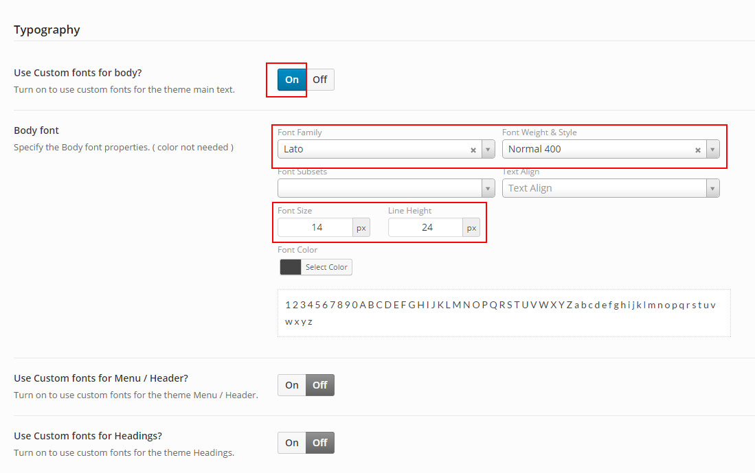
Step 3 - Saves Changes
Change Header Menu Font / Typography
Step 1 - Log in your WordPress Admin click TheFox > Typography.
Step 2 - If you want to change the Header / Menu change Use Custom fonts for Menu / Header? to On. Then choose the font the font weight, font size and line-height. The Color is not set here, to change Header Color go to Header Styling options Tab to change Dropdown Color go to Dropdown Styling options Tab 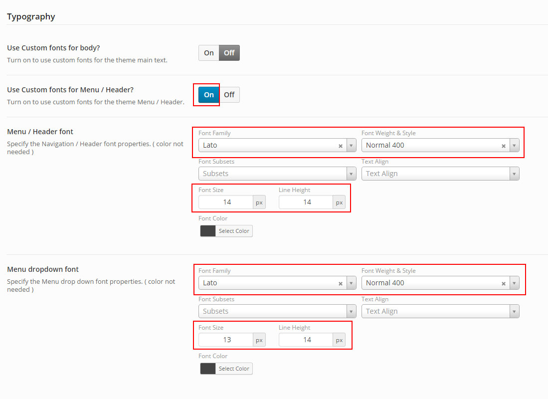
Step 3 - Saves Changes
Change Headings Font / Typography
Step 1 - Log in your WordPress Admin click TheFox > Typography.
Step 2 - If you want to change the Headings change Use Custom fonts for Headings? to On. Then choose the font the font weight, font size and line-height. The Color is not set here, to change Color check the other Styling options Tab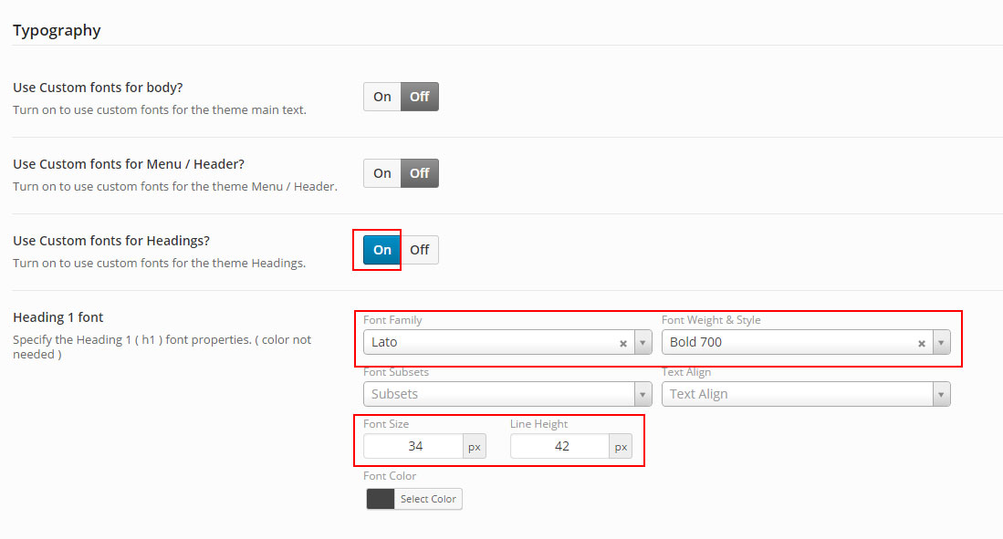
Step 3 - Saves Changes
Set Up Coming Soon Page
Follow the next step to learn how to set the Coming Soon Page.
Coming Soon Page
Step 1 - Log in your WordPress Admin click TheFox > Coming Soon Page.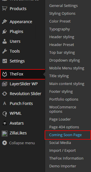
Step 2 - First Select if you want use Light or Dark design then set the Top page of the Loader, Logo and Bar Color.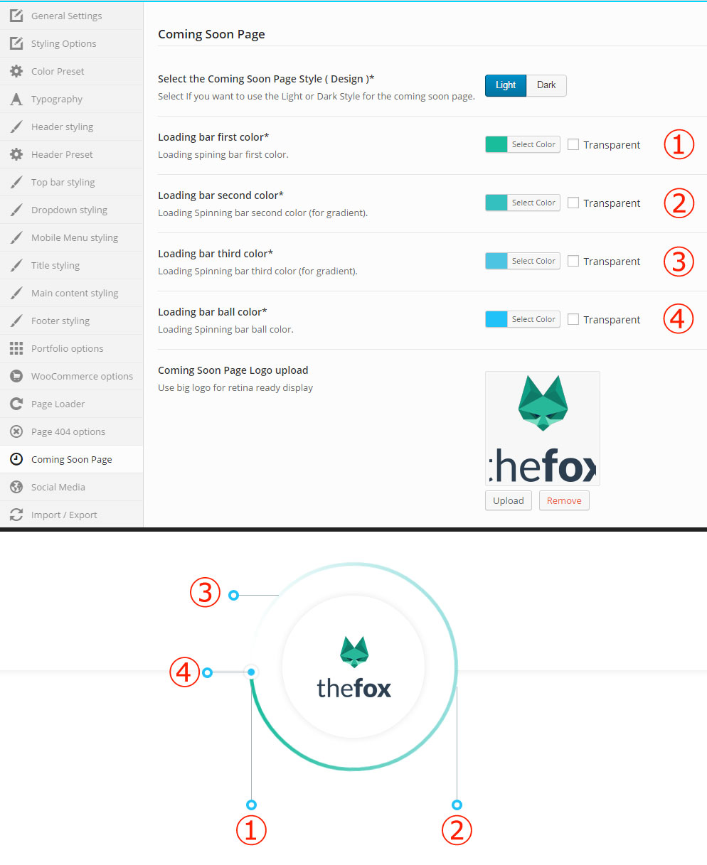
Step 3 - Set the Loader Text and Release Date and the Color and text for the Countdown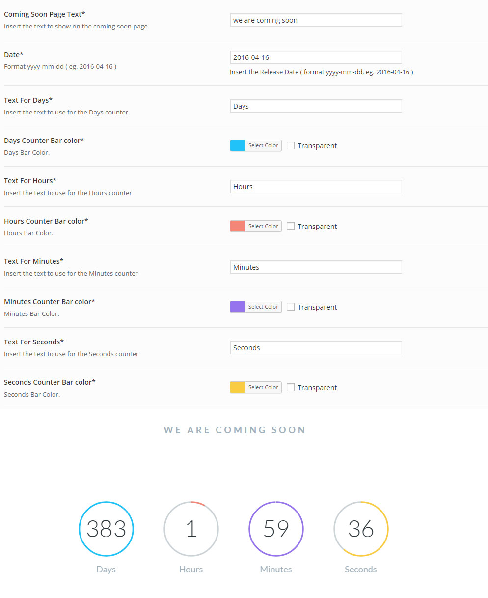
Step 4 - If you want to use a mail form, change Use Mail Form to Yes, put your email the email subject and set the Form placeholder.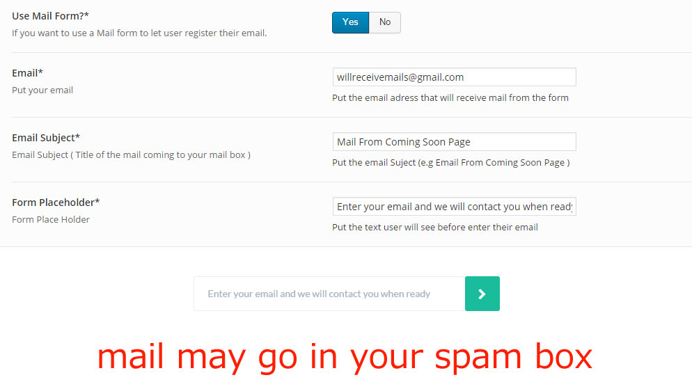
Step 5 - Create a new page Pages > Add New. Set the Page title and change the page template to Coming Soon, then Publish your page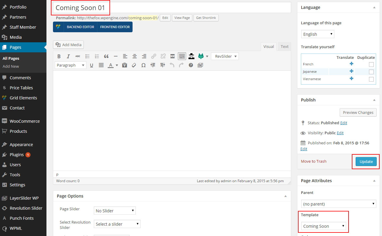
Child Theme
TheFox comes with a Child Theme.
Simply install TheFox_Child.zip like a regular WordPress theme.
What is a Child Theme?
A child theme is a theme that inherits the functionality of another theme, called the parent theme. Child themes allow you to modify, or add to the functionality of that parent theme. A child theme is the best, safest, and easiest way to modify an existing theme, whether you want to make a few tiny changes or extensive changes. Instead of modifying the theme files directly, you can create a child theme and override within.
Why use a Child Theme?
If you modify an existing theme and it is updated, your changes will be lost. With a child theme, you can update the parent theme (which might be important for security or functionality) and still keep your changes. It’s a great way to get started if you are just learning WordPress theme development.
Additional Links
Disable Comments
Comments are enabled on WordPress by default. You can change this default for new posts or pages you’ll publish in the future, as well as change it for posts or pages you already published.
To change the defaults for new posts or pages, go to Settings → Discussion.
To disable comments on an existing post/page/project, open it up for editing. Now beneath the main content area, you should see a box labeled “Discussion”. Simply uncheck both boxes and save your changes.

What if you can’t see the discussion box?
Then you need to click the “Screen Options” tab in the upper right corner of your screen and check the box to enable the discussion module. You still need to close the tab and navigate to the bottom of the page and uncheck “Allow Comments” in the discussion module.

Theme Update via WordPress
Updating the theme via WordPress is very similar to the install process via WordPress.
Follow the steps below to update your theme via WordPress:
Step 1 - Log into your WordPress Dasrdoard.
Step 2 - Go to Appearance > Themes.
Step 3 - Deactivate the TheFox Theme by simply activating a different theme. Once you activate a different theme, you can delete the TheFox theme.
Step 4 - Delete the TheFox Theme. Do not worry, your content will not be lost!
Step 5 - Then simply upload the new “TheFox.zip” file in the Appearance > Themes section. Click on the Install Themes tab at the top and choose to upload the zip file. You have this step explained in section: Theme Installation via WordPress.
Theme Update via FTP
Updating the theme via FTP is very similar to the install process via FTP.
Follow the steps below to update your theme via FTP:
Step 1 - Go to .../wp-content > themes location on your server using a FTP client and backup your "TheFox" theme folder by saving it to your computer, or you can choose to simply delete it. Your content will not be lost.
Step 2 - Download the new version of TheFox theme from your Themeforest and retrieve TheFox folder by unpacking the zip that you download from Themeforest and TheFox_(version.number).zip.
Step 3 - Then simply drag and drop the new "TheFox" theme folder into .../wp-content > themes location. Choose to “Replace” the current one if you did not delete it.
Step 4 - Log into your WordPress Dasrdoard, go to Appearance > Themes and activate the new TheFox theme.
Speed Optimization
If you think your website takes too much time to load maybe you should.
- Install a Cache Plugin for WordPress. We recommend W3 Total Cache.
- Install an Image Compress Plugin. We recommend WP Smush It.
- Install a Database Optimizer Plugin We recommend WP Optimize
- Reduce the number of posts on the page
- Reduce the number of unnecessary plugins.
- Use more icons and less images.
Changelog
Version 1.23 (2015.6.17)
- Added New Header type ( center ).
- Added New features.
- Security update for prettyphoto.
Version 1.22 (2015.6.10)
- Changed lightbox effect.
- Added new Woocommerce template.
- Upgraded responsive layout.
Version 1.21 (2015.6.8)
- Added Compability to Woocommerce Braintree and Subscription.
- Added new theme options and features.
Version 1.20 | Big Update + Trending Demo (2015.5.30)
- Added Trending Demo.
- Added New Blog Styling options.
- Added New WooCommerce Style.
- Added New Icon Boxes Style.
- Added New Slider effect.
Version 1.12 (2015.5.19)
- Changed and minimized Demo content.
- Added new transparent header text color features.
Version 1.11 (2015.5.18)
- Added new demo content.
Version 1.10 | The Big Update (2015.5.17)
- Added One page demo.
- Added Possibility to change transparent header color and opacity %.
- Added Possibility to use different logo for mobile devices.
Version 1.03 (2015.5.10)
- Added new mo and po files.
Version 1.02 (2015.5.09)
- Added gallery module.
- Added slider and title option to staff member post.
- Added possibility to build portfolio post as page ( project layout option ).
- Added possibility to select link target for icon box and staff member.
Version 1.01 (2015.5.07)
- Fixed Layerslider issue.
- Fixed Child Theme tinymce / text block issue.
Version 1.00 (2015.5.07)
- First Release!